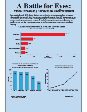
Over the last decade we have seen an extreme change in the formula in which we stream video entertainment. I wanted to take a deeper look in the transformation from cable TV to the world of video streaming platforms that currently dominate the market.
Because many of these services are subscription based, the largest graphic explains the popularity of each platform based on monthly users. Being that YouTube is a free platform, it is no surprise that it takes the lead in the US.
When looking for statistics concerning this topic, I was able to find a survey conducted during the COVID-19 pandemic, which I thought would bring a lot of relevancy to the graph. This explained the percentage of Americans possessing a paid video streaming subscription in the US by generation. I thought this was interesting because we often discount the use of this technology by older demographics. Lastly, to give a larger scope of the growth of the industry I used a line chart showing revenue from its inception around 2011, to 2019.
If I could change anything looking back, it would be searching into the data more before deciding on my topic. The data was harder to find than I would have expected and I even had to start some free trial accounts to even access some of the spreadsheets provided. Also I still experience difficulty in the gridding and placing of graphic elements from time to time.
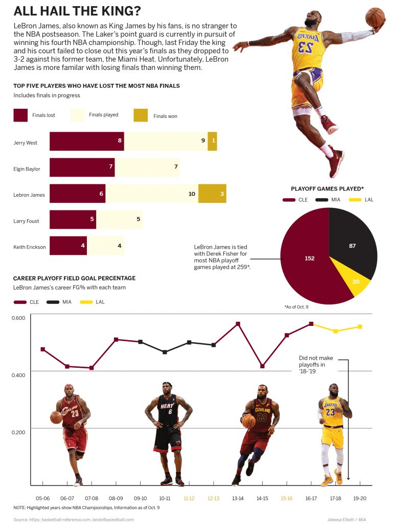
Basketball fans all have their opinion of who is the greatest of all-time. We’ve seen LeBron James dominate the league for the past 17 years. I have always been skeptical of James and his king status, (I think Indiana native, Oscar Robertson is the GOAT). For this infographic I wanted to explore LeBron James playoff history as he was currently competing in the playoffs with the Lakers.
One statistic I found interesting was that he was the third most in playoffs lost. This is shown by the bar graph. I also wanted to highlight the most insane fact, which is James being tied with Derek Fisher for most NBA playoff games. A pie graph visualized this well, and gave me the opportunity to show his statistics with each team. I think that these two graphics together contextualize James’ playoff performance.
The bottom line chart displays James average playoff field goal attempts. With this chart I attempted to highlight his talent and performance but also reinforces his playoff misfortune. Fortunately for James, he did win a championship after this graphic was completed.
One thing I was concerned about was the color scheme of the graphic. I felt like it was appropriate to include the team colors in a sports graphic. Though, I showed the different teams of LeBron and I am not confident that the colors work as well as they could.
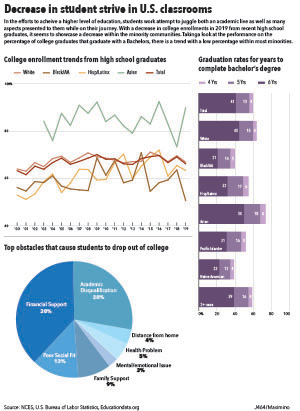
For my first infographic project I decided to look into the stance of minorities within the education system. Specifically heading towards secondary education and further. From the information researched I chose to focus on 3 aspects of information.
The first being the college enrollment rate of recent high school graduates. This information would be able to give. a better understanding on what the trend of how many high school graduates do attend a college/university, and the data was divided by race to be able to track a trend over the previous years. From that point I decided to look into the rate of completion for those pursuing a bachelor’s degree, and this was also sectioned by race as well as institutions that are either 4, 5, 6 years for completion of a bachelor’s. While looking at the data I decided to add information on the reasons that could be behind the incompletion of college students which can also fall into the decision of continuing education after high school. I felt this would give a better look into the decisions made.
I decided to give each graph its own color to avoid any form of mix up with other keys in other graphs. In the graph with graduation rates for bachelor’s degree I decided to have the sections of the stacked bar to transition in a lighter hue to represent the decrease of people that graduate within a longer year institute. I did find some struggle organizing the information for it to not look too plain or with weird spacing. I want to work more on creating a better theme when making the graphs work together, and be able to incorporate more color themes.
God, COVID really ruins everything! I feel like my biggest achievement with this project is conceiving of something that could have been really powerful with better data available but that wasn’t necessarily feasible as what I wanted it to be right now, and then doing the best I could with it. Box office data is easy to come by, and so rendering a bunch of graphics about what happened to the theatrical experience (mostly in terms of financial success) was pretty easy. But what I was really fascinated by is the rise of streaming and premium VOD releases and how that changed this year. Because that increasingly seems like the future of movies, if there is one.
The first significant problem that I ran into there is just that that data wasn’t readily available. Frustrating! Essentially, there are lots of websites that report weekly numbers of VOD box office rankings, but don’t give the specific numbers to compare between platforms (when “Mulan” released, say, it would have been interesting to compare its number one ranking on Disney plus to a less expensive movie’s number one on a different platform) or a source for where to get more info on that. So I was stuck with this. I was able to use IMDB and Box Office Mojo to construct a trifecta of graphs that cover box office grosses, the comparison of the biggest 2020 tentpoles to the biggest 2019 tentpoles, and the release formats of this year’s biggest movies. That was pretty limited, but it worked well enough. There are, of course, problems with that because it would have been impossible to get accurate release information on every movie that released this year to have a fuller sample size from which to calculate percentages of each release type (and even within those, characterizing each type was tricky because you’ve got movies like The Invisible Man that released theatrically and then were put on VOD for $20 rentals when theaters closed, which I noted as a hybrid, but you’ve also got plenty of movies that released for premium rental rates with very limited drive-in engagements – so is that hybrid because it’s multi-format or virtual because the vast majority of that film’s box office take came from rentals. Or is it something else entirely! Do I need a Kinsey scale for 2020 release formats?) And the bar chart is obviously not perfect because it’s hard to compare the numbers for all of last year’s big movies to those of the movies that have released this year so far — but my train of thought there was that most of this year’s chart toppers (9 of 10) are movies that began or completed their theatrical runs early in the year pre-COVID and so likely won’t be topped by anything coming out between now and the end of the year; and with that in mind it’s about as close a comparison of this year to last year that I could get without waiting until 2021.
Visually, I tried to lay things out in a way that draws you through the graphic in the order that things occurred or became significant. That is you skim through the explainer text, then follow the line chart on the bottom of the graphic as it walks you through the year of chaos week-by-week so that you get a portrait of how significant the changes are. Then, to show the magnitude of that mapped out across an entire year, you get to the bar chart on the right, which is slanted biggest to smallest left to right so that the incline pushes your eyes back up to maybe the least significant graphic, the release format pie chart. And for the color palette, because nothing specific really jumped out at me, I drew colors from a frame from one of my favorite films, Wong Kar Wai’s ethereally moody and all around exquisite “In the Mood for Love.”
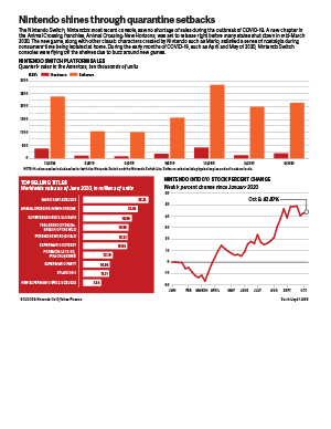
I decided to research how Nintendo sales have changed since the outbreak of COVID-19 in the United States. Right as states in the U.S. started shutting down stores and restaurants in mid-March, Nintendo released the newest installment of the Animal Crossing franchise, Animal Crossing: New Horizons. The nostalgic factor of a franchise that has been around since the release of the Nintendo GameCube releasing a new game before a period of isolation caused a lot of hype on social media. Twitter went wild after the game was released on the Nintendo Switch, and provided something wholesome and fun to do during uncertain and scary times.
As I was looking for data regarding sales, the Nintendo website actually had a lot of data that I was looking for. They had sales data from up until June of this year, which is a pretty decent dataset. However, I wanted to include more data with a wider range, so I found the stock information for Nintendo on Yahoo Finance. That gave a great overview of how the company was doing. Even though games and consoles were supposedly flying off the shelves in March, the stock fell that month and rose up again in April. I wanted to add a graphic that didn’t rely so much on inferring from numbers, so I found information from Nintendo’s website on the top-selling Switch games since the console had been released. I thought it was interesting to see which games were the most popular. I was expecting Animal Crossing: New Horizons to top the list, but it came up in second place.
I stuck with a simple color scheme for this graphic, using a bright red that resembles the logo of Nintendo, and an orange shade to represent the software sales (because the eShop logo is white and orange). I created a new stylesheet for this project and chose a new typeface: Adelle Sans. I had only used Roboto for infographics until now, but I’m happy to choose a new typeface. I like Adelle Sans because it’s really rounded, easy to read, and had lots of variations, including a condensed version.
Overall, I’m pretty satisfied with my graphic. I think the strongest chart in the graphic is the stock changes because it easily shows how Nintendo was affected during the outbreak of COVID-19. However, my favorite chart is the list of the top games on the Switch. I am, really happy with how it turned out, and I feel like it’s a creative way to list the games and their corresponding sales numbers. In the future, I hope to be more creative and think outside the box when it comes to infographics. I tend to stick to the norm because it’s something new to me, but I’m hoping to make something more my style (instead of a basic style) in the next projects.
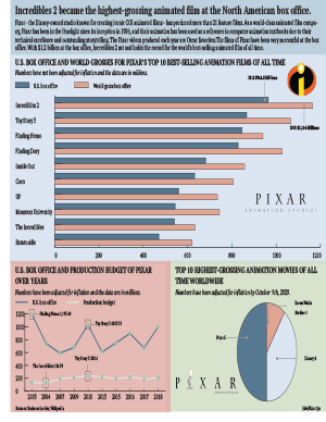
Disney, Pixar and DreamWorks have long been considered the three most prestigious animated film manufacturing companies. Disney and Pixar, in particular, have been with me throughout my childhood with their works. To this day, the Incredibles series is still my favorite movie of all time. So I wanted to make a table to investigate the financial investment and box office receipts of Pixar films.
First, I’ve used a bar chart to show the U.S. box office and world totals of Pixar’s top ten highest grossing films. As it turns out, Incredibles 2 takes the number one spot with a staggering box office. It took Pixar 14 years to make this movie, and it’s hard to be a hit when you can say that Incredibles 2 contains some of Pixar’s best technology and most heart and soul. My data here does not take inflation into account, as the US rate of inflation is different from the world’s overall rate of inflation. To avoid unnecessary data errors, I’ve chosen to show it in actual box office.
I then used a bar chart to show, in chronological order, Pixar’s financial investment and US box office. Since Pixar doesn’t release new movies every year, there are some years missing from the chart. Here my figures take inflation into account, as all values are inflated in the US based on year. I’ve marked a few values that I think are important, and surprisingly, with inflation taken into account, Finding Nemo became the clear box office winner by a landslide over Toy Story and Incredibles. On the other hand, Pixar hasn’t had a lot of float in terms of financial investment, and has been in the $1.3 million to $2 million range.
The third chart I’ve chosen to show circular statistics showing the studio distribution of the ten highest-grossing films to date at the global box office. I was curious to see what people in different countries thought of the three studios. Here my figures are from Wikipedia and they have been calculated for inflation. As I thought, Pixar has half of the top ten films, Disney has four films, and DreamWorks has one.
From a designer’s point of view, this assignment did take a lot of effort on my part. First I had to determine the color tone of the entire table. Since it’s about Pixar’s chart, I decided to use some light colors. Of course there are some contrasting colors in my chart to highlight the changes in values and create a visual effect of contrast, but the overall saturation is low because every time I think of Pixar, all I think of is joy, happiness and joy. Another thing is because I used a black font, a less saturated background color makes it easier for the reader to read and pay attention to the data on the table, greatly improving the readability of the chart.In the bar chart I inserted the logos for both Incredibles and Pixar, I didn’t use any other color for the number one ranked character, Incredibles 2, so I inserted separate logos to show its status. In the circular chart I’ve inserted the logo of Pixar’s other very famous lamp, a mischievous little lamp that many people are impressed by and which has become a branding icon for Pixar and has had a profound effect on Pixar’s brand recognition, so I felt it was important to include it in my chart.
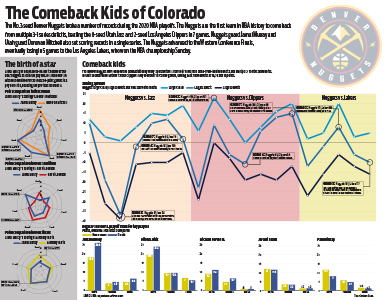
The Denver Nuggets’ playoff run this season was nothing short of spectacular and one of the high points of the NBA bubble. Behind Jamal Murray and Nikola Jokic they came back from two 3-1 leads against the Utah Jazz and the Los Angeles Clippers, but lost to the eventual champion Los Angeles Lakers.
In my project there were a few things I really wanted to hit on. Jamal Murray and Donovan Mitchell battled in the first round and broke NBA playoff scoring records. I challenged myself and went with radar charts to compare Murray’s scoring compared to each of the other team’s leading scorer in each series. I think these three in comparison really show how high Murray and Mitchell’s scoring marks were compared to a normal playoff series.
For my main chart, I really wanted to hit on how much time the Nuggets spent trailing and how crazy their comebacks were. To do this I did a line chart with three different lines — their biggest lead, their biggest deficit and the final point differential. I think it’s pretty telling that the range of the chart was 25 to -40.
Lastly, I wanted to break down who really showed up for the Nuggets in the playoffs and who didn’t play as well. I used simple bar charts to chart five Nuggets players’ regular season stats to their playoff stats. Jamal Murray and Nikola Jokic really stepped up and solidified themselves as the team’s best players, and Paul Millsap and Jerami Grant didn’t step up in the way the Nuggets would have needed them to in order to get past the Lakers.
I think what makes this project work is the prior planning that I did and the time I took to come up with ideas for how I wanted to put this together. It was pretty heavily covered that they were coming back from big deficits, so I wanted that to be the main part of the graphic. I also knew how well Jamal Murray had been playing so I wanted to get something in there about his performance. Then the last group of graphs were simply to show how the team did. If I had tried to brainstorm ideas any later than I did I wouldn’t have had time to actually get them done. I’m happy with how it turned out and would like to continue doing sports-related work in the future.
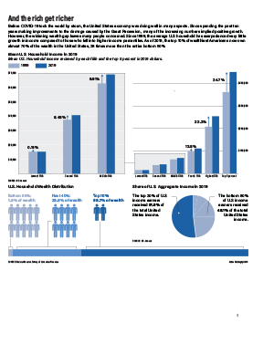
Income and wealth inequality is one of the biggest issues facing the United States today, and the issues is worsening, becoming more and more urgent. However, the raw numbers in dollars can be difficult for the human mind to comprehend, and many members of the population do not realize how drastic the wealth and income numbers are skewing in favor of a tiny, wealthy top percent of our country. Therefore, I felt these numbers would be represented by comparing percentages, making the information easier to comprehend.
I have included 2 bar graphs, one being a zoomed in version of a smaller portion of the other chart. I felt the lower half of the data needed to be zoomed in to place emphasis on the drastic differences in the increase in incomes between each fifth of the United States population. I also included a single bar broken up into 3 groups of Americans, based on how much wealth they have. I felt it was important to visually show a comparison of the amount of people in each group to show how imbalanced the numbers are, hence the use of the stick figures. My pie chart has a similar goal, portraying how a small percent of Americans make over half of the overall income earned in the entire country. I decided to show this data in just 2 groups, showing how one tiny percentage compares to the entire rest of the country.
The main aspect I struggled with in my package was choosing a color scheme. I was weary of using the same colors on each graph, as the graphs are divided into different percentages of people, but was having difficulty finding 6-7 different colors that fit well together without looking childish. Therefore, I decided to use the same colors to keep the package looking professional and cohesive.
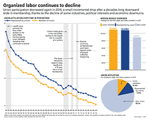
I really care about labor and workers’ rights and all that (my dad was a Teamster!) so I used the most recent set of data on union membership as released by the Bureau of Labor Statistics.
I was of course struck by the decline evident in the numbers available from 1983 onward., and I wanted to use that line chart as the big piece of the package; I wanted to do some sort of callout box, but two lines with events that apply to both seemed odd to do callout boxes with so I ended up going with this highlighted year/information approach instead and tried to not make it too too text heavy.
The pie chart puts that decline into a larger perspective, showing just how many workers aren’t union-affiliated at all, and the median weekly earnings are there to give some sort of perspective beyond just membership numbers: this is a system that improves pay for workers this flatly laid out, and this system has been declining for years.
I do wish I was more creative with this, but I didn’t want to force any hackneyed graphics of like, workers’ fists or strikes or anything so I figured it was best to just stick to the numbers.