Categories
Diagram J. Elliott

Rovers run the red planet

Click the image to see a full-sized PDF of the diagram.

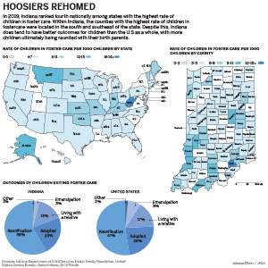
I was considering doing a diagram on how to crochet simple stitches, or a diagram on how to make holiday drink cocktail. The idea of drawing a diagram on a rover came to me out of the blue. I knew drawing something as detailed as a rover would be a challenge. Though, I felt that my strongest skill in Illustrator is the pen tool and that I could created something that sort of resembled a rover.

I encountered a few hiccups during the design process. The first hiccup was me not knowing exactly how detailed a rover was. This setback my schedule, and I had to work overtime on this project. The second hiccup was after I had finished drawing the entire rover, I realized that I had not drawn the current rover that NASA has just launched into Mars in June 2020. I had actually drawn the NASA Mars rover from over 15 years ago. This rover was also a twin. NASA had sent two identical rovers into space in 2003. It turned out to be OK, as there were still some newsworthy elements with the previous rovers and a lot of good data on it. Lastly, I did not copy-edit as closely as I would have liked. After I had turned in my project I noticed in the explainer I forgot to mention the year that these rovers launched into space, which was 2003.

As for the design, I figured that creating an anatomical diagram of the Spirit and Opportunity rovers would be the best diagram. It was a little hard to draw some aspects of the rovers, because my reference photos were not actual photographs, but graphics rendered in a 3D program. I had to think a lot about depth and perspective.

Because there were two rovers, this gave me more wiggle room with where I wanted to place the information. I wanted the background to look like the rovers were on Mars. This required some tutorial watching on my least favorite Adobe program, photoshop.

Though I am not particularly interested in space, I found searching and learning about these two rovers and NASA’s mission for them quite fun.

Categories
Map

Hoosiers Rehomed

My map package

My inforgraphic digs into the number of children in the U.S. foster care systems and our local foster care system in 2019. I chose to research this topic because I knew there could be a lot of interesting government data that I could find. I was overwhelmed by the amount of data that had been reported on, not just the general number of children in the U.S. who are in the foster care system, but in Indiana as well.

I was able to find the amount of children in foster care in each state pretty easily. Then I calculated a rate per 1000 people under the age of 18 in each state. With this data, I made a sequential U.S. map that shows the rate of children in foster care in each state for 2019.

Through the Indiana Department of Child Services, I was able to find a database that keeps record of how many children enter and exit foster care in all 92 counties in Indiana. However, this data did not have an average for each county for 2019. I had to manually enter the amount of children in foster care for each of the 92 counties for each month of the year. Then I calculated the rate per 1000 people under 18 in each of those counties. Because I had to do so much googling to find population data, I came across some particularly useful Indiana population data websites that had an influx of information. With this information, I created an Indiana map with all 92 counties and showed the rate of children in foster care for 2019.

I decided to add two supplementary charts in order to context, and to compare Indiana to the rest of the U.S. These charts show the outcomes of children exiting foster care. This information comes from Childtrends.org, a research organization that focuses on improving the lives of vulnerable youth.

Despite the intensive data scrubbing, I was surprised that I was able to find all the data that I wanted. Looking back at my graphic, I don’t think that I was as clear in my labeling as I should have been to really explain the data.

Categories
Chart

LeBron tries once more

Basketball fans all have their opinion of who is the greatest of all-time. We’ve seen LeBron James dominate the league for the past 17 years. I have always been skeptical of James and his king status, (I think Indiana native, Oscar Robertson is the GOAT). For this infographic I wanted to explore LeBron James playoff history as he was currently competing in the playoffs with the Lakers.

One statistic I found interesting was that he was the third most in playoffs lost. This is shown by the bar graph. I also wanted to highlight the most insane fact, which is James being tied with Derek Fisher for most NBA playoff games. A pie graph visualized this well, and gave me the opportunity to show his statistics with each team. I think that these two graphics together contextualize James’ playoff performance.

The bottom line chart displays James average playoff field goal attempts. With this chart I attempted to highlight his talent and performance but also reinforces his playoff misfortune. Fortunately for James, he did win a championship after this graphic was completed.

One thing I was concerned about was the color scheme of the graphic. I felt like it was appropriate to include the team colors in a sports graphic. Though, I showed the different teams of LeBron and I am not confident that the colors work as well as they could.