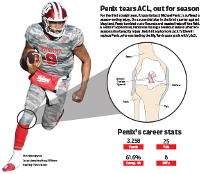
This project was really spur of the moment. I had an idea to break down the throwing motion of Peyton Manning, but I was having difficulty finding something to go off. I was with my girlfriend and she jokingly said to do something on Michael Penix Jr. and that gave me the idea draw a diagram of a torn because he suffered one. It was very quick, but I think the newsworthiness and the layout of this graphic makes it good.
I found the picture of Penix on Getty images and made the cutout, then found a diagram of a torn ACL on a health website. The rest was really simple, I used some of the elements of our past modules like the spotlight on his knee to show exactly what I was showing and some stats to fill space. I’m not a talented illustrator by any means, but something simple like a knee allowed me to put something together that didn’t require a lot of complex illustration techniques while still being able to give readers context to a big, relevant story. I’m really happy with how this turned out considering the late idea switch that happened and my lack of illustration skills.
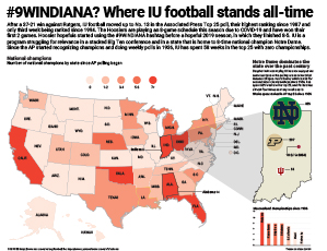
IU football is enjoying one if its best seasons of all-time this year. Not typically a powerhouse, IU has knocked off three top-25 teams this season and risen in the ranks to higher points than it has in decades.
For my project I wanted to look historically at where IU stands in the state of Indiana and where the state stands throughout the country. I used a choropleth to show which states have the most national championships all-time, then in a spotlight on Indiana I showed which states have spent the most time ranked in the Associated Press poll since it began. Ultimately, what it shows is Indiana is near the top in national championships all-time, all 8 of which have come from Notre Dame, and IU has spent less than 60 weeks ranked in the AP poll compared to Notre Dame’s 800+.
I think map does what I intended it to do well. I was hoping to show comparatively how poor IU’s football program has been compared to other schools in the state of Indiana. I used a lot of elements of map making that we learned in class and included a graph to add further context to the topic. Overall, I’m happy with what I came up with in this map.
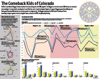
The Denver Nuggets’ playoff run this season was nothing short of spectacular and one of the high points of the NBA bubble. Behind Jamal Murray and Nikola Jokic they came back from two 3-1 leads against the Utah Jazz and the Los Angeles Clippers, but lost to the eventual champion Los Angeles Lakers.
In my project there were a few things I really wanted to hit on. Jamal Murray and Donovan Mitchell battled in the first round and broke NBA playoff scoring records. I challenged myself and went with radar charts to compare Murray’s scoring compared to each of the other team’s leading scorer in each series. I think these three in comparison really show how high Murray and Mitchell’s scoring marks were compared to a normal playoff series.
For my main chart, I really wanted to hit on how much time the Nuggets spent trailing and how crazy their comebacks were. To do this I did a line chart with three different lines — their biggest lead, their biggest deficit and the final point differential. I think it’s pretty telling that the range of the chart was 25 to -40.
Lastly, I wanted to break down who really showed up for the Nuggets in the playoffs and who didn’t play as well. I used simple bar charts to chart five Nuggets players’ regular season stats to their playoff stats. Jamal Murray and Nikola Jokic really stepped up and solidified themselves as the team’s best players, and Paul Millsap and Jerami Grant didn’t step up in the way the Nuggets would have needed them to in order to get past the Lakers.
I think what makes this project work is the prior planning that I did and the time I took to come up with ideas for how I wanted to put this together. It was pretty heavily covered that they were coming back from big deficits, so I wanted that to be the main part of the graphic. I also knew how well Jamal Murray had been playing so I wanted to get something in there about his performance. Then the last group of graphs were simply to show how the team did. If I had tried to brainstorm ideas any later than I did I wouldn’t have had time to actually get them done. I’m happy with how it turned out and would like to continue doing sports-related work in the future.