Categories
Diagram M. Eslava

A pandemic check-up

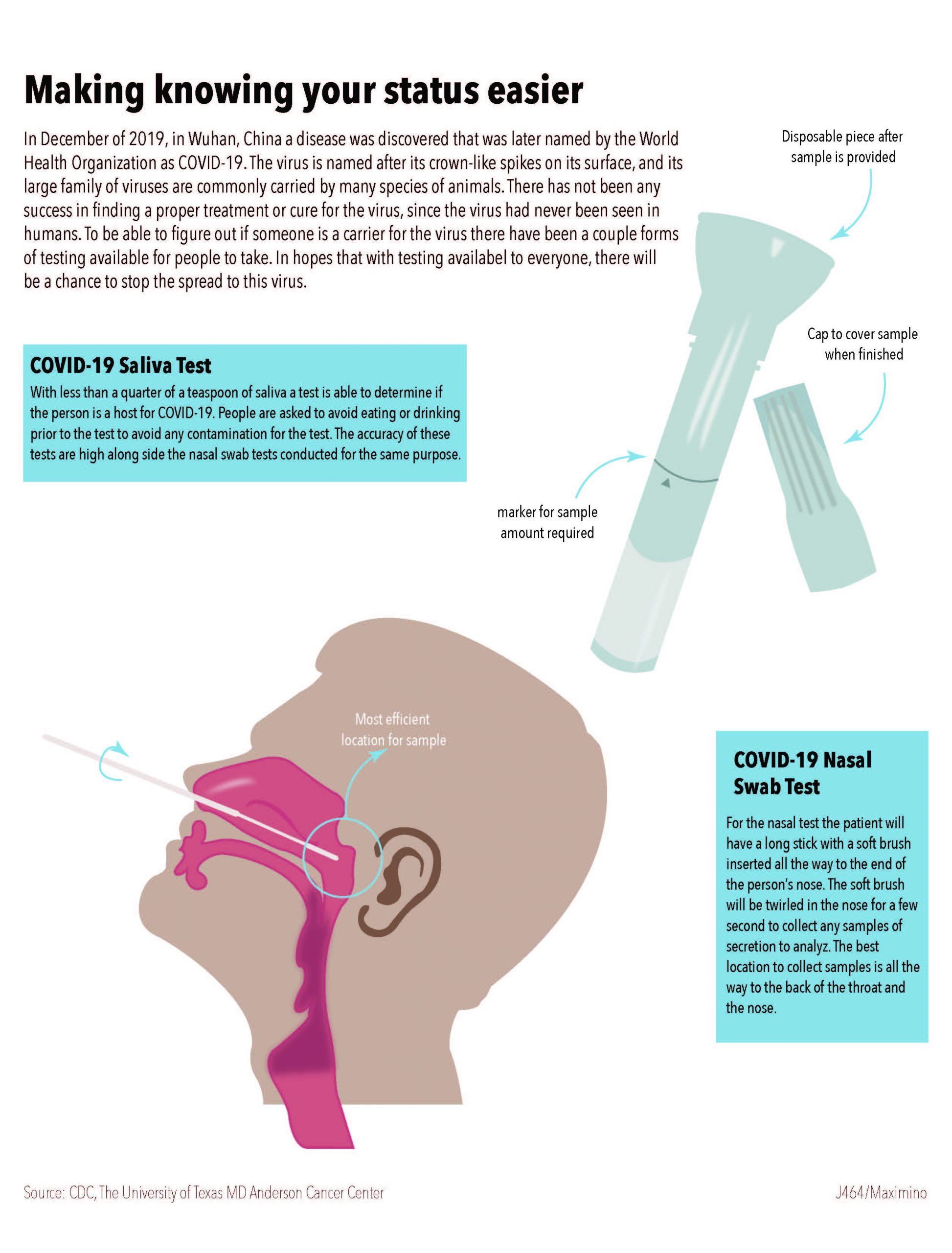
When considering to dive into the subject of COVID-19 for the project, I considered what options I would have to create sort of diagram. I wanted to focus on the effects on mental health but there weren’t many detailed options to explain. So, I decided to focus on the tests themselves to show what each exam is and its importance to figuring out a person’s status. There is a fear with only having one option for testing and I wanted to provide the other saliva test as an example.

I searched for an image that would be able to give me a more detailed idea of what to base the diagram off. When looking for a way to provide more details about the saliva test, I considered the pieces of the test and its significance.

When placing the information I tried to have the illustrations break the grid slightly to make the overall project to have some change and dynamic element. Having parts of the saliva test explained with arrows and small bits of information give a bit more to look at for the graphic.

Categories
M. Eslava Map

Indiana’s size in Education

When considering topics for this project I had decided to work on comparing information on polling locations in Indiana, but it came to be difficult to find polling locations for all the counties. So I decided to shift gears and focus on the number of higher education that is available in Indiana, as well as compared to other states in the United States. I researched the enrollment amount for colleges in Indiana and looked at the schools with the largest amount of enrollment. This showed Ivy Tech Community College with the highest number. I also decided to show the range of each states number of colleges that they have in their state.

I decided to grow with a green color pallet to keep the variation in color minimal since there was not much of a variety in the key colors being used. I showcased the US map with the gradient of color throughout to keep the color consistent. I attempted to incorporate more information, but I ran into the issue of having the data used for the assignment to make sense and correlate with one another.

Categories
Chart M. Eslava

Minorities’ strive in education

Project 1 Education performance
Click the image to see the PDF.

For my first infographic project I decided to look into the stance of minorities within the education system. Specifically heading towards secondary education and further. From the information researched I chose to focus on 3 aspects of information.

The first being the college enrollment rate of recent high school graduates. This information would be able to give. a better understanding on what the trend of how many high school graduates do attend a college/university, and the data was divided by race to be able to track a trend over the previous years. From that point I decided to look into the rate of completion for those pursuing a bachelor’s degree, and this was also sectioned by race as well as institutions that are either 4, 5, 6 years for completion of a bachelor’s. While looking at the data I decided to add information on the reasons that could be behind the incompletion of college students which can also fall into the decision of continuing education after high school. I felt this would give a better look into the decisions made.

I decided to give each graph its own color to avoid any form of mix up with other keys in other graphs. In the graph with graduation rates for bachelor’s degree I decided to have the sections of the stacked bar to transition in a lighter hue to represent the decrease of people that graduate within a longer year institute. I did find some struggle organizing the information for it to not look too plain or with weird spacing. I want to work more on creating a better theme when making the graphs work together, and be able to incorporate more color themes.