Categories
Diagram S. Lloyd

The Right Way to Apply Skincare

Skincare routine infographic
Click the image above to see the full-size pdf.

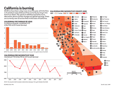
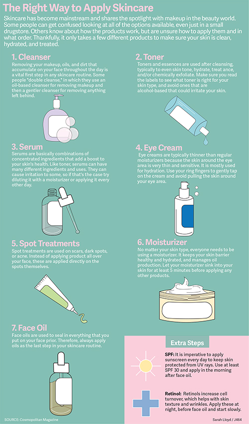
This infographic assignment was covering diagrams. I decided to do a diagram about skincare and the right order to apply products because skincare has been an interest of mine lately. When I first learned about skincare routines, I had a hard time figuring out the right order to apply all of these products. I remember having to Google the correct order and do research on it.

I found a pretty extensive article on Cosmopolitan Magazine’s website on the correct order to apply products, so I used that as my main source. I stuck with a numbered list format in a grid because I wanted the information to be organized and easy to read. I wrote a short summary of each product and what it does, and some tips for application as well. For the bottom of the graphic, I had some extra space so I added a box for some extra steps.

For the illustrations, I decided to keep them minimal. I just wanted a basic shape for each product. Some I based on products that I own, and others I had to research and find a reference photo. I kept the same relative theme with the labels, overall shape design, and highlight lines. I added some bubbles/spots/squirts of product to add some interest throughout. For the extras box, I just made some simple icons with a white outline.

Overall, I think my graphic looks pretty clean. I kind of wish that I had ordered them a bit more creatively, but a classic grid is a good go-to. I also might have added some variety in the background by adding different colored boxes for each row or something similar. I like the color scheme, but it was difficult to choose between white or black text. I think that the full graphic itself is a bit easier to read than the thumbnail. It was interesting to do the research and I feel like I learned quite a bit. I might keep this graphic handy for when I want to update my own skincare routine.

Categories
Map S. Lloyd

California is Burning

Image of map project
Click the image above for the full-size pdf.

For the map project, I wanted to document the effects of climate change in an area of the country. I was debating between researching wildfires or hurricane damage. After doing a bit of initial research, I decided to create a graphic about the wildfires in California.

Wildfires have been in the news pretty regularly this year, starting with the wildfires in Australia that destroyed around 26 million acres of land. However, I wanted to cover something a bit more current than that. In California, there are still active fires burning currently and the smoke has traveled into the cities. I’ve seen many Californians posting videos of the fires and smokey skies on social media, and I feel like there have been more fires and damage this year than previous seasons. I found the California Department of Forestry and Fire Protection (CAL FIRE) website and discovered lots of information and records of fires in the past years.

With this information, I was able to create a map with the number of reported fires this year in each county of California. I drew the state outline and each county outline for the map and colored each county using a sequential color scheme according to the total number of incidents I found. It was a bit tedious to tally up that information because I had to go through a chart of each logged fire this year and add to the numbers for each county. I added numbers to locate each of the counties and listed them on the right side of the map.

The two charts were a lot easier to create. I found data for fire damage per year and fire incidents per year in yearly reports, so I logged the numbers in a spreadsheet and transferred them into Illustrator. I chose a bar graph for the fire damage amounts and you can clearly see that the damage this year has surpassed the previous years by a large amount. I chose a line graph for the fire incidents numbers because they tended to fluctuate a bit more and didn’t have any crazy outliers.

The data from CAL FIRE was very useful to draw conclusions and make the charts and maps for this project. I’m glad that I could find all the information I needed in one place. If I was able to change anything in this graphic, I would want to play around with the layout a bit more. All of the county names look a bit crowded. However, I think the color scheme really helps tie everything together and lets the viewer draw simple conclusions with a quick glance.

Categories
Chart S. Lloyd

Nintendo sales recover through COVID-19

A set of charts.
Click the image to see the full-size pdf.

I decided to research how Nintendo sales have changed since the outbreak of COVID-19 in the United States. Right as states in the U.S. started shutting down stores and restaurants in mid-March, Nintendo released the newest installment of the Animal Crossing franchise, Animal Crossing: New Horizons. The nostalgic factor of a franchise that has been around since the release of the Nintendo GameCube releasing a new game before a period of isolation caused a lot of hype on social media. Twitter went wild after the game was released on the Nintendo Switch, and provided something wholesome and fun to do during uncertain and scary times.

As I was looking for data regarding sales, the Nintendo website actually had a lot of data that I was looking for. They had sales data from up until June of this year, which is a pretty decent dataset. However, I wanted to include more data with a wider range, so I found the stock information for Nintendo on Yahoo Finance. That gave a great overview of how the company was doing. Even though games and consoles were supposedly flying off the shelves in March, the stock fell that month and rose up again in April. I wanted to add a graphic that didn’t rely so much on inferring from numbers, so I found information from Nintendo’s website on the top-selling Switch games since the console had been released. I thought it was interesting to see which games were the most popular. I was expecting Animal Crossing: New Horizons to top the list, but it came up in second place.

I stuck with a simple color scheme for this graphic, using a bright red that resembles the logo of Nintendo, and an orange shade to represent the software sales (because the eShop logo is white and orange). I created a new stylesheet for this project and chose a new typeface: Adelle Sans. I had only used Roboto for infographics until now, but I’m happy to choose a new typeface. I like Adelle Sans because it’s really rounded, easy to read, and had lots of variations, including a condensed version.

Overall, I’m pretty satisfied with my graphic. I think the strongest chart in the graphic is the stock changes because it easily shows how Nintendo was affected during the outbreak of COVID-19. However, my favorite chart is the list of the top games on the Switch. I am, really happy with how it turned out, and I feel like it’s a creative way to list the games and their corresponding sales numbers. In the future, I hope to be more creative and think outside the box when it comes to infographics. I tend to stick to the norm because it’s something new to me, but I’m hoping to make something more my style (instead of a basic style) in the next projects.