Categories
A. Mattingly Diagram

Four Years of Billie Eilish

Click the image to see the enlarged infographic.

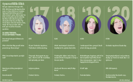
Billie Eilish, age 18, is one of the biggest and fastest-rising stars in the music industry today. After writing, producing, and releasing her first song, Ocean Eyes, at the age of 14, Eilish quickly rose to stardom and swept the 2020 Grammy’s, taking home 5 awards. Vanity Fair has interviewed Billie Eilish on the same day for four years in a row. As one of my favorite artists, I thought it would be interesting to illustrate Billie Eilish as she looked in each of the four interviews to show the change in her appearance over time, as well as her mindset as reflected in some of her answers.

In the past, I have been more focused on topics that deal with economic or social issues, but I decided to stray from that a bit with this project and focus in on something that I see as relevant to possible future careers. I’m super interested in music and pop culture, as well as vector art inspired by pop culture, so I decided to create a package that would be seen in a magazine, rather than a newspaper. While the style, in terms of color and layout, is much different than my other packages, I’m happy that I stepped out of my comfort zone and allowed myself to use colors other than black and white. I’ve mentioned color palettes as a big struggle for me in the other two projects, and I think the problem is that I was trying too hard to keep my style consistent with a newspaper piece, rather than letting my creativity take over. I did keep my typography consistent with my previous styles, apart from the large numbers displaying the years.

Overall, I am pretty happy with the layout, colors, and illustrations in this package. I was nervous that maybe it’s not explanatory enough to be considered a diagram, but I really wanted the focus to be on the change of Billie Eilish, in terms of looks and personality, throughout the past 4 years. Looking back, I probably should’ve incorporated some arrows to represent the idea of progression and made it more obvious the goal I had in mind. Similarly, after further inspection of my illustrations, there are some inconsistencies regarding the style of the four illustrations, and there are some tweaks I could make to ensure they all look cohesive.

Categories
Diagram T. Jackson

Penix tears ACL, out for season

My diagram of Michael Penix Jr.'s torn ACL.
Click the graphic for a closer look!

This project was really spur of the moment. I had an idea to break down the throwing motion of Peyton Manning, but I was having difficulty finding something to go off. I was with my girlfriend and she jokingly said to do something on Michael Penix Jr. and that gave me the idea draw a diagram of a torn because he suffered one. It was very quick, but I think the newsworthiness and the layout of this graphic makes it good.

I found the picture of Penix on Getty images and made the cutout, then found a diagram of a torn ACL on a health website. The rest was really simple, I used some of the elements of our past modules like the spotlight on his knee to show exactly what I was showing and some stats to fill space. I’m not a talented illustrator by any means, but something simple like a knee allowed me to put something together that didn’t require a lot of complex illustration techniques while still being able to give readers context to a big, relevant story. I’m really happy with how this turned out considering the late idea switch that happened and my lack of illustration skills.

Categories
Diagram S. Lloyd

The Right Way to Apply Skincare

Skincare routine infographic
Click the image above to see the full-size pdf.

This infographic assignment was covering diagrams. I decided to do a diagram about skincare and the right order to apply products because skincare has been an interest of mine lately. When I first learned about skincare routines, I had a hard time figuring out the right order to apply all of these products. I remember having to Google the correct order and do research on it.

I found a pretty extensive article on Cosmopolitan Magazine’s website on the correct order to apply products, so I used that as my main source. I stuck with a numbered list format in a grid because I wanted the information to be organized and easy to read. I wrote a short summary of each product and what it does, and some tips for application as well. For the bottom of the graphic, I had some extra space so I added a box for some extra steps.

For the illustrations, I decided to keep them minimal. I just wanted a basic shape for each product. Some I based on products that I own, and others I had to research and find a reference photo. I kept the same relative theme with the labels, overall shape design, and highlight lines. I added some bubbles/spots/squirts of product to add some interest throughout. For the extras box, I just made some simple icons with a white outline.

Overall, I think my graphic looks pretty clean. I kind of wish that I had ordered them a bit more creatively, but a classic grid is a good go-to. I also might have added some variety in the background by adding different colored boxes for each row or something similar. I like the color scheme, but it was difficult to choose between white or black text. I think that the full graphic itself is a bit easier to read than the thumbnail. It was interesting to do the research and I feel like I learned quite a bit. I might keep this graphic handy for when I want to update my own skincare routine.

Categories
Diagram J. Elliott

Rovers run the red planet

Click the image to see a full-sized PDF of the diagram.

I was considering doing a diagram on how to crochet simple stitches, or a diagram on how to make holiday drink cocktail. The idea of drawing a diagram on a rover came to me out of the blue. I knew drawing something as detailed as a rover would be a challenge. Though, I felt that my strongest skill in Illustrator is the pen tool and that I could created something that sort of resembled a rover.

I encountered a few hiccups during the design process. The first hiccup was me not knowing exactly how detailed a rover was. This setback my schedule, and I had to work overtime on this project. The second hiccup was after I had finished drawing the entire rover, I realized that I had not drawn the current rover that NASA has just launched into Mars in June 2020. I had actually drawn the NASA Mars rover from over 15 years ago. This rover was also a twin. NASA had sent two identical rovers into space in 2003. It turned out to be OK, as there were still some newsworthy elements with the previous rovers and a lot of good data on it. Lastly, I did not copy-edit as closely as I would have liked. After I had turned in my project I noticed in the explainer I forgot to mention the year that these rovers launched into space, which was 2003.

As for the design, I figured that creating an anatomical diagram of the Spirit and Opportunity rovers would be the best diagram. It was a little hard to draw some aspects of the rovers, because my reference photos were not actual photographs, but graphics rendered in a 3D program. I had to think a lot about depth and perspective.

Because there were two rovers, this gave me more wiggle room with where I wanted to place the information. I wanted the background to look like the rovers were on Mars. This required some tutorial watching on my least favorite Adobe program, photoshop.

Though I am not particularly interested in space, I found searching and learning about these two rovers and NASA’s mission for them quite fun.

Categories
Diagram M. Eslava

A pandemic check-up

When considering to dive into the subject of COVID-19 for the project, I considered what options I would have to create sort of diagram. I wanted to focus on the effects on mental health but there weren’t many detailed options to explain. So, I decided to focus on the tests themselves to show what each exam is and its importance to figuring out a person’s status. There is a fear with only having one option for testing and I wanted to provide the other saliva test as an example.

I searched for an image that would be able to give me a more detailed idea of what to base the diagram off. When looking for a way to provide more details about the saliva test, I considered the pieces of the test and its significance.

When placing the information I tried to have the illustrations break the grid slightly to make the overall project to have some change and dynamic element. Having parts of the saliva test explained with arrows and small bits of information give a bit more to look at for the graphic.

Categories
A. Aguiar Diagram

Behind the jaws of “Jaws”

A diagram showing one of the animatronic sharks from the movie "Jaws."
Click the image to see a full-sized PDF of the diagram.

I felt as if my previous projects for this class were a little lacking, so I really wanted to do something that pushed me and would be a really solid piece — at first I was thinking about doing an instructional recipe diagram for key lime pie (I love both eating and making key lime pie) or a step-by-step process for the old-school process of comic inking and coloring, but couldn’t find a way of doing the former I liked/wouldn’t be a bunch of glop in a bowl and couldn’t find a clear process source for the latter. This was my next idea, a diagram explaining the mechanisms and story of the animatronic sharks from “Jaws,” one of my favorite films ever. I didn’t realize until I was almost done, but this is now the second “Jaws”-related assignment I have done for a class taught by Steve Layton. What can I say? It’s a good movie.

I went in search of some resources for this diagram and a still from the movie I could confidently illustrate and combine a diagram version of underneath the water for that — luckily, “Jaws”‘ 40th anniversary in 2015 lead to a whole new round of nostalgia-driven content, including some looks back at the animatronic sharks Spielberg and company used in the film.

I knew that my illustration would be focused on the above-water action and the mechanisms below, but my original plan of having all of it in one component became a little unwieldy once I realized the scale of the mechanism that I wanted to recreate. I instead chose to break away the diagram into a box and have essentially two annotated diagrams, 1. the larger illustration and the top of the pivot arm to show dimensionality and share some tidbits from production and 2. the labeled workings of the so-called “shark sled” in an awkwardly left behind negative space to the lower right of the illustration.

Something I went back and forth on was how to treat the shark’s body underwater — while I had some useful resources of the opened-up body suspended above the water, I had nothing underwater AND assumed that they would of course shut the hatch for shooting underwater. I also wasn’t sure how to meaningfully render the above/under water difference between the two parts of the shark, and I think the outline approach for the submerged shark body works in this case and draws attention to the big old pivot arm he’s attached to. I also chose to not further illustrate the sinking boat, because I thought it would be a distraction, I didn’t have a reliable resource for it and most of it would end up being covered by the breakaway box and annotations anyway.

I’m especially proud of the larger illustration — a gradient mesh approach just wasn’t working for me on the shark’s head, so I ended up using a base color and doing a bunch of shapes that I then applied a Gaussian blur to to “blend” into the illustration. A clipping mask in the shape of the shark’s outline cleaned up any blur extending outside the lines, and it was done. Also, I spent a fair amount of time on the proper 3D effects for the pivot arm illustration, making a rectangular prism from 4 differently-rotated iterations of the 2D arm I drew for the shark sled diagram. Overall, I’m very happy with this!

Categories
Diagram K. Qu

IVY TECH Locations in Indiana

click the image to see the PDF!

I did think about many topics before I made the map project, but I finally decided to make a map of the distribution of IVY TECH in Indiana. This is because I took an online class at IVY TECH last semester at my friend’s suggestion and because more and more IU students were willing to take classes at IVY TECH during the epidemic. So I decided to make a map about IVY TECH to briefly introduce the location of it.

Ivy Community College, Indiana’s community college system, which includes more than 40 campuses, is the largest public postsecondary institution in the state and the largest single-accredited statewide community college system in the nation. It’s mostly located in Indiana, so I wanted to make a map of Indiana first to mark the distribution of IVY TECH. I had no prior idea that IVY was so densely distributed in Indiana and was very surprised indeed. After drawing the outline of Indiana with the pen tool, I started making the IVY logo in Illustrator. IVY’s logo isn’t that complicated, like a sapling. The lines are all straight, so it’s done with a pen tool. Then I have to make the background color, the sampling and the circle as a group. In the Indiana map I emphasize Indianapolis since it is the capital of Indiana.

Then I decided to make a map of IVY in Bloomington. This will be more detailed and cover more detail than the entire Indiana map. I’ve interspersed iconic buildings and interstate highways to help the reader better understand the orientation. Finally, I’ve made a little compass logo to tell the reader north and south.

From a design standpoint, I’m very mindful of the color scheme this time around. I didn’t want my map to be so saturated that it made the readability low. I chose the Morandi color card so that the map looks very harmonious, like a complete whole. Then I chose a light green to fill out the Indiana and Bloomington map because to me Indiana looks like it’s in a forest, and the greenery is done wonderfully. On the outside of the Bloomington map I chose to make a lighter border to create a sense of space visually.