
Over the last decade we have seen an extreme change in the formula in which we stream video entertainment. I wanted to take a deeper look in the transformation from cable TV to the world of video streaming platforms that currently dominate the market.
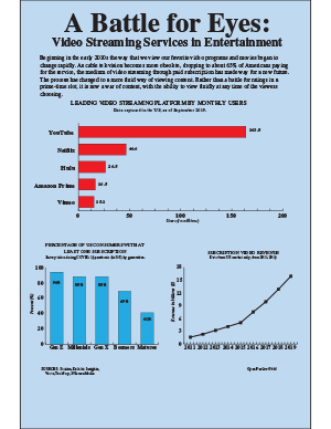
Because many of these services are subscription based, the largest graphic explains the popularity of each platform based on monthly users. Being that YouTube is a free platform, it is no surprise that it takes the lead in the US.
When looking for statistics concerning this topic, I was able to find a survey conducted during the COVID-19 pandemic, which I thought would bring a lot of relevancy to the graph. This explained the percentage of Americans possessing a paid video streaming subscription in the US by generation. I thought this was interesting because we often discount the use of this technology by older demographics. Lastly, to give a larger scope of the growth of the industry I used a line chart showing revenue from its inception around 2011, to 2019.
If I could change anything looking back, it would be searching into the data more before deciding on my topic. The data was harder to find than I would have expected and I even had to start some free trial accounts to even access some of the spreadsheets provided. Also I still experience difficulty in the gridding and placing of graphic elements from time to time.