Categories
Uncategorized

Gone but never forgotten: what we know about the mysterious Utah monolith

click the image to open a PDF of my diagram!

For my third and final illustrator project this semester, I wanted to challenge myself to do something different than my previous work, which was largely focused on pandemic-related stories about what’s happening in the world of entertainment. That was in part because there isn’t an easy subject matter to conceive of there that makes for a compelling diagram (a map of theater distanced-seating regulations? yawn), so I set my sights on something I thought would be more visually interesting: the now-vanished Utah monolith.

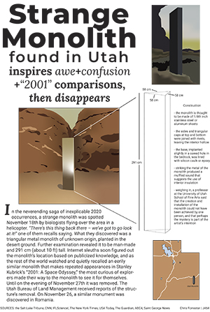
Admittedly, it’s lacking as a piece of subject matter in one key way for this project, which is that it’s not especially complicated to illustrate and its construction is fairly simple: three sides, a base, a top. The rest is all interior (and has never been/will never be seen) and/or speculated. To compensate for that I wanted to include more playful illustrations so that my diagram would still give me a chance to flex my illustrator muscles. The main illustration was the obvious choice, although I wish that I had actually left the monolith in the illustration there as a white skeleton like the one on the right, and then had the actual “diagram” be in color to add a more dynamic element to the main graphic. I also think that the white skeleton of the monolith looks a bit bland where it’s placed, and produces a weird chessboard effect where there’s color in the top right, middle left, and bottom right of the diagram. In hindsight I also think that I could have been more creative with the 2001 reference; if I were to go back and do this again, I would choose an even fatter slab font for “Strange Monolith Found in Utah” and stretched that text across all three columns, then converted it to outlines and used it as a clipping mask for a wider illustration of the monolith – that’s more fun! It’s less obvious in construction but also makes better and more interesting use of space, and doesn’t distract so much from the design of the news-worthy parts of the diagram so much.

I also added a map because it seemed to me that if the monolith itself is so mysterious in construction, then one of the more important things that *is* known about it is where it once stood.

Categories
C. Forrester Chart

What Happened to all the Movies?

click to see a pdf

God, COVID really ruins everything! I feel like my biggest achievement with this project is conceiving of something that could have been really powerful with better data available but that wasn’t necessarily feasible as what I wanted it to be right now, and then doing the best I could with it. Box office data is easy to come by, and so rendering a bunch of graphics about what happened to the theatrical experience (mostly in terms of financial success) was pretty easy. But what I was really fascinated by is the rise of streaming and premium VOD releases and how that changed this year. Because that increasingly seems like the future of movies, if there is one.

The first significant problem that I ran into there is just that that data wasn’t readily available. Frustrating! Essentially, there are lots of websites that report weekly numbers of VOD box office rankings, but don’t give the specific numbers to compare between platforms (when “Mulan” released, say, it would have been interesting to compare its number one ranking on Disney plus to a less expensive movie’s number one on a different platform) or a source for where to get more info on that.
So I was stuck with this. I was able to use IMDB and Box Office Mojo to construct a trifecta of graphs that cover box office grosses, the comparison of the biggest 2020 tentpoles to the biggest 2019 tentpoles, and the release formats of this year’s biggest movies. That was pretty limited, but it worked well enough. There are, of course, problems with that because it would have been impossible to get accurate release information on every movie that released this year to have a fuller sample size from which to calculate percentages of each release type (and even within those, characterizing each type was tricky because you’ve got movies like The Invisible Man that released theatrically and then were put on VOD for $20 rentals when theaters closed, which I noted as a hybrid, but you’ve also got plenty of movies that released for premium rental rates with very limited drive-in engagements – so is that hybrid because it’s multi-format or virtual because the vast majority of that film’s box office take came from rentals. Or is it something else entirely! Do I need a Kinsey scale for 2020 release formats?) And the bar chart is obviously not perfect because it’s hard to compare the numbers for all of last year’s big movies to those of the movies that have released this year so far — but my train of thought there was that most of this year’s chart toppers (9 of 10) are movies that began or completed their theatrical runs early in the year pre-COVID and so likely won’t be topped by anything coming out between now and the end of the year; and with that in mind it’s about as close a comparison of this year to last year that I could get without waiting until 2021.

Visually, I tried to lay things out in a way that draws you through the graphic in the order that things occurred or became significant. That is you skim through the explainer text, then follow the line chart on the bottom of the graphic as it walks you through the year of chaos week-by-week so that you get a portrait of how significant the changes are. Then, to show the magnitude of that mapped out across an entire year, you get to the bar chart on the right, which is slanted biggest to smallest left to right so that the incline pushes your eyes back up to maybe the least significant graphic, the release format pie chart. And for the color palette, because nothing specific really jumped out at me, I drew colors from a frame from one of my favorite films, Wong Kar Wai’s ethereally moody and all around exquisite “In the Mood for Love.”