Categories
Map T. Jackson
This is my map project, where I broke down the states with the most college football national championships and the best programs in Indiana.
Click the graphic to get a better look!

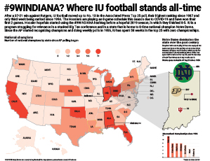
#9WINDIANA? Where IU football stands all-time

IU football is enjoying one if its best seasons of all-time this year. Not typically a powerhouse, IU has knocked off three top-25 teams this season and risen in the ranks to higher points than it has in decades.

For my project I wanted to look historically at where IU stands in the state of Indiana and where the state stands throughout the country. I used a choropleth to show which states have the most national championships all-time, then in a spotlight on Indiana I showed which states have spent the most time ranked in the Associated Press poll since it began. Ultimately, what it shows is Indiana is near the top in national championships all-time, all 8 of which have come from Notre Dame, and IU has spent less than 60 weeks ranked in the AP poll compared to Notre Dame’s 800+.

I think map does what I intended it to do well. I was hoping to show comparatively how poor IU’s football program has been compared to other schools in the state of Indiana. I used a lot of elements of map making that we learned in class and included a graph to add further context to the topic. Overall, I’m happy with what I came up with in this map.

Categories
M. Eslava Map

Indiana’s size in Education

When considering topics for this project I had decided to work on comparing information on polling locations in Indiana, but it came to be difficult to find polling locations for all the counties. So I decided to shift gears and focus on the number of higher education that is available in Indiana, as well as compared to other states in the United States. I researched the enrollment amount for colleges in Indiana and looked at the schools with the largest amount of enrollment. This showed Ivy Tech Community College with the highest number. I also decided to show the range of each states number of colleges that they have in their state.

I decided to grow with a green color pallet to keep the variation in color minimal since there was not much of a variety in the key colors being used. I showcased the US map with the gradient of color throughout to keep the color consistent. I attempted to incorporate more information, but I ran into the issue of having the data used for the assignment to make sense and correlate with one another.

Categories
A. Aguiar Map

A blue spot in a red place

A map of Indiana's 9th Congressional district by voter registration and 2016 results.

So, for this project I was still very much in election mode carried over from my IDS work, and I’m really interested in Congressional districting (that sounds so lame to actually say) and have always heard, since I came here and as part of the out-of-state marketing for students (we promise it’s not the rest of Indiana) so I wanted to look at the breakdown of the 9th district and tell two different stories in the graphic, how many registered voters are in each county heading into the election and what a recent election shows the leaning of the district to be. I thought that doing those two together would give particular insight on the district heading into last week’s election, and showing in data how Bloomington’s blue spot in a red place and the rest of the district means that one of the most populous counties does not have much of a say.

I wanted to use the results from the 2018 midterms, but oddly Indiana doesn’t report that data county-by-county, so I went with 2016 results. I figured that’s a fair choice, given how many more people typically vote in general elections. I went with this combination of a choropleth and proportional symbols map for the two different data sets because I thought that way they can both clearly communicate on the graphic without getting in the way of the other — I think doing those within only one graphic framework would muddle the numbers from 2016 and 2020. Like I did for the deadliner, I created a scale for the proportional symbols with the biggest, smallest and somewhere in the middle counties (was going to pull out Monroe for reference, but it looked odd to have two large bubbles and I didn’t want to use Monroe as the largest one if i wasn’t the largest county).

Looking at it again, I think some of my text color choices (particularly the cities) are a little muddled, and maybe I could have gone with a range of colors that was a little lighter overall.

Categories
A. Mattingly Map

COVID-19 College Enrollment

Click the image to see the enlarged graphic.

Following the transition from in-person to remote-online learning by colleges and universities across the nation, many predicted an overall decrease in enrollment. While these predictions were true in a majority of states, the drop was less drastic than expected.

The most difficult aspect of this project was gathering data. While I was able to find some recent, reliable data for the U.S. map, finding Fall 2020 enrollment numbers for the Indiana schools was especially challenging. I was unable to find numbers for all of the schools on my list, and I had difficultly making the decision of which schools to include in the first place. Apart from the data, I also am not very pleased with the Indiana map as a whole. I really wanted to incorporate the school logos as a visual component, but it feels to me as if the red is overwhelming, and the map as a whole feels like it’s missing something.

Once again, I struggled with the color palette within the package as a whole. Red and green felt like the best colors to use for differentiating between positive and negative numbers, but these colors inherently register as “Christmas” to me. The choice of red also posed issues within the Indiana map and the overwhelming presence of red within the logos. Overall, I do feel that the package conveys the information I was aiming for, and I do feel confident in the reliability of my data, but my overall styling could use some work for my taste.

Categories
Map

Hoosiers Rehomed

My map package

My inforgraphic digs into the number of children in the U.S. foster care systems and our local foster care system in 2019. I chose to research this topic because I knew there could be a lot of interesting government data that I could find. I was overwhelmed by the amount of data that had been reported on, not just the general number of children in the U.S. who are in the foster care system, but in Indiana as well.

I was able to find the amount of children in foster care in each state pretty easily. Then I calculated a rate per 1000 people under the age of 18 in each state. With this data, I made a sequential U.S. map that shows the rate of children in foster care in each state for 2019.

Through the Indiana Department of Child Services, I was able to find a database that keeps record of how many children enter and exit foster care in all 92 counties in Indiana. However, this data did not have an average for each county for 2019. I had to manually enter the amount of children in foster care for each of the 92 counties for each month of the year. Then I calculated the rate per 1000 people under 18 in each of those counties. Because I had to do so much googling to find population data, I came across some particularly useful Indiana population data websites that had an influx of information. With this information, I created an Indiana map with all 92 counties and showed the rate of children in foster care for 2019.

I decided to add two supplementary charts in order to context, and to compare Indiana to the rest of the U.S. These charts show the outcomes of children exiting foster care. This information comes from Childtrends.org, a research organization that focuses on improving the lives of vulnerable youth.

Despite the intensive data scrubbing, I was surprised that I was able to find all the data that I wanted. Looking back at my graphic, I don’t think that I was as clear in my labeling as I should have been to really explain the data.

Categories
Map S. Lloyd

California is Burning

Image of map project
Click the image above for the full-size pdf.

For the map project, I wanted to document the effects of climate change in an area of the country. I was debating between researching wildfires or hurricane damage. After doing a bit of initial research, I decided to create a graphic about the wildfires in California.

Wildfires have been in the news pretty regularly this year, starting with the wildfires in Australia that destroyed around 26 million acres of land. However, I wanted to cover something a bit more current than that. In California, there are still active fires burning currently and the smoke has traveled into the cities. I’ve seen many Californians posting videos of the fires and smokey skies on social media, and I feel like there have been more fires and damage this year than previous seasons. I found the California Department of Forestry and Fire Protection (CAL FIRE) website and discovered lots of information and records of fires in the past years.

With this information, I was able to create a map with the number of reported fires this year in each county of California. I drew the state outline and each county outline for the map and colored each county using a sequential color scheme according to the total number of incidents I found. It was a bit tedious to tally up that information because I had to go through a chart of each logged fire this year and add to the numbers for each county. I added numbers to locate each of the counties and listed them on the right side of the map.

The two charts were a lot easier to create. I found data for fire damage per year and fire incidents per year in yearly reports, so I logged the numbers in a spreadsheet and transferred them into Illustrator. I chose a bar graph for the fire damage amounts and you can clearly see that the damage this year has surpassed the previous years by a large amount. I chose a line graph for the fire incidents numbers because they tended to fluctuate a bit more and didn’t have any crazy outliers.

The data from CAL FIRE was very useful to draw conclusions and make the charts and maps for this project. I’m glad that I could find all the information I needed in one place. If I was able to change anything in this graphic, I would want to play around with the layout a bit more. All of the county names look a bit crowded. However, I think the color scheme really helps tie everything together and lets the viewer draw simple conclusions with a quick glance.