Categories
A. Aguiar Diagram

Behind the jaws of “Jaws”

A diagram showing one of the animatronic sharks from the movie "Jaws."
Click the image to see a full-sized PDF of the diagram.

I felt as if my previous projects for this class were a little lacking, so I really wanted to do something that pushed me and would be a really solid piece — at first I was thinking about doing an instructional recipe diagram for key lime pie (I love both eating and making key lime pie) or a step-by-step process for the old-school process of comic inking and coloring, but couldn’t find a way of doing the former I liked/wouldn’t be a bunch of glop in a bowl and couldn’t find a clear process source for the latter. This was my next idea, a diagram explaining the mechanisms and story of the animatronic sharks from “Jaws,” one of my favorite films ever. I didn’t realize until I was almost done, but this is now the second “Jaws”-related assignment I have done for a class taught by Steve Layton. What can I say? It’s a good movie.

I went in search of some resources for this diagram and a still from the movie I could confidently illustrate and combine a diagram version of underneath the water for that — luckily, “Jaws”‘ 40th anniversary in 2015 lead to a whole new round of nostalgia-driven content, including some looks back at the animatronic sharks Spielberg and company used in the film.

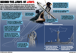
I knew that my illustration would be focused on the above-water action and the mechanisms below, but my original plan of having all of it in one component became a little unwieldy once I realized the scale of the mechanism that I wanted to recreate. I instead chose to break away the diagram into a box and have essentially two annotated diagrams, 1. the larger illustration and the top of the pivot arm to show dimensionality and share some tidbits from production and 2. the labeled workings of the so-called “shark sled” in an awkwardly left behind negative space to the lower right of the illustration.

Something I went back and forth on was how to treat the shark’s body underwater — while I had some useful resources of the opened-up body suspended above the water, I had nothing underwater AND assumed that they would of course shut the hatch for shooting underwater. I also wasn’t sure how to meaningfully render the above/under water difference between the two parts of the shark, and I think the outline approach for the submerged shark body works in this case and draws attention to the big old pivot arm he’s attached to. I also chose to not further illustrate the sinking boat, because I thought it would be a distraction, I didn’t have a reliable resource for it and most of it would end up being covered by the breakaway box and annotations anyway.

I’m especially proud of the larger illustration — a gradient mesh approach just wasn’t working for me on the shark’s head, so I ended up using a base color and doing a bunch of shapes that I then applied a Gaussian blur to to “blend” into the illustration. A clipping mask in the shape of the shark’s outline cleaned up any blur extending outside the lines, and it was done. Also, I spent a fair amount of time on the proper 3D effects for the pivot arm illustration, making a rectangular prism from 4 differently-rotated iterations of the 2D arm I drew for the shark sled diagram. Overall, I’m very happy with this!

Categories
A. Aguiar Map

A blue spot in a red place

A map of Indiana's 9th Congressional district by voter registration and 2016 results.

So, for this project I was still very much in election mode carried over from my IDS work, and I’m really interested in Congressional districting (that sounds so lame to actually say) and have always heard, since I came here and as part of the out-of-state marketing for students (we promise it’s not the rest of Indiana) so I wanted to look at the breakdown of the 9th district and tell two different stories in the graphic, how many registered voters are in each county heading into the election and what a recent election shows the leaning of the district to be. I thought that doing those two together would give particular insight on the district heading into last week’s election, and showing in data how Bloomington’s blue spot in a red place and the rest of the district means that one of the most populous counties does not have much of a say.

I wanted to use the results from the 2018 midterms, but oddly Indiana doesn’t report that data county-by-county, so I went with 2016 results. I figured that’s a fair choice, given how many more people typically vote in general elections. I went with this combination of a choropleth and proportional symbols map for the two different data sets because I thought that way they can both clearly communicate on the graphic without getting in the way of the other — I think doing those within only one graphic framework would muddle the numbers from 2016 and 2020. Like I did for the deadliner, I created a scale for the proportional symbols with the biggest, smallest and somewhere in the middle counties (was going to pull out Monroe for reference, but it looked odd to have two large bubbles and I didn’t want to use Monroe as the largest one if i wasn’t the largest county).

Looking at it again, I think some of my text color choices (particularly the cities) are a little muddled, and maybe I could have gone with a range of colors that was a little lighter overall.

Categories
A. Aguiar Chart

Union membership continues to drop

Annie Aguiar's Chart project.
Click the image to see the full-size PDF.

I really care about labor and workers’ rights and all that (my dad was a Teamster!) so I used the most recent set of data on union membership as released by the Bureau of Labor Statistics.

I was of course struck by the decline evident in the numbers available from 1983 onward., and I wanted to use that line chart as the big piece of the package; I wanted to do some sort of callout box, but two lines with events that apply to both seemed odd to do callout boxes with so I ended up going with this highlighted year/information approach instead and tried to not make it too too text heavy.

The pie chart puts that decline into a larger perspective, showing just how many workers aren’t union-affiliated at all, and the median weekly earnings are there to give some sort of perspective beyond just membership numbers: this is a system that improves pay for workers this flatly laid out, and this system has been declining for years.

I do wish I was more creative with this, but I didn’t want to force any hackneyed graphics of like, workers’ fists or strikes or anything so I figured it was best to just stick to the numbers.