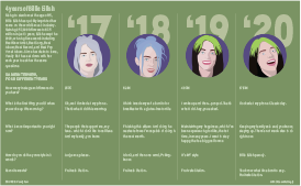
Billie Eilish, age 18, is one of the biggest and fastest-rising stars in the music industry today. After writing, producing, and releasing her first song, Ocean Eyes, at the age of 14, Eilish quickly rose to stardom and swept the 2020 Grammy’s, taking home 5 awards. Vanity Fair has interviewed Billie Eilish on the same day for four years in a row. As one of my favorite artists, I thought it would be interesting to illustrate Billie Eilish as she looked in each of the four interviews to show the change in her appearance over time, as well as her mindset as reflected in some of her answers.
In the past, I have been more focused on topics that deal with economic or social issues, but I decided to stray from that a bit with this project and focus in on something that I see as relevant to possible future careers. I’m super interested in music and pop culture, as well as vector art inspired by pop culture, so I decided to create a package that would be seen in a magazine, rather than a newspaper. While the style, in terms of color and layout, is much different than my other packages, I’m happy that I stepped out of my comfort zone and allowed myself to use colors other than black and white. I’ve mentioned color palettes as a big struggle for me in the other two projects, and I think the problem is that I was trying too hard to keep my style consistent with a newspaper piece, rather than letting my creativity take over. I did keep my typography consistent with my previous styles, apart from the large numbers displaying the years.
Overall, I am pretty happy with the layout, colors, and illustrations in this package. I was nervous that maybe it’s not explanatory enough to be considered a diagram, but I really wanted the focus to be on the change of Billie Eilish, in terms of looks and personality, throughout the past 4 years. Looking back, I probably should’ve incorporated some arrows to represent the idea of progression and made it more obvious the goal I had in mind. Similarly, after further inspection of my illustrations, there are some inconsistencies regarding the style of the four illustrations, and there are some tweaks I could make to ensure they all look cohesive.

