Categories
A. Aguiar Map

A blue spot in a red place

A map of Indiana's 9th Congressional district by voter registration and 2016 results.

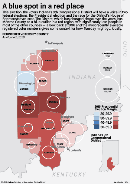
So, for this project I was still very much in election mode carried over from my IDS work, and I’m really interested in Congressional districting (that sounds so lame to actually say) and have always heard, since I came here and as part of the out-of-state marketing for students (we promise it’s not the rest of Indiana) so I wanted to look at the breakdown of the 9th district and tell two different stories in the graphic, how many registered voters are in each county heading into the election and what a recent election shows the leaning of the district to be. I thought that doing those two together would give particular insight on the district heading into last week’s election, and showing in data how Bloomington’s blue spot in a red place and the rest of the district means that one of the most populous counties does not have much of a say.

I wanted to use the results from the 2018 midterms, but oddly Indiana doesn’t report that data county-by-county, so I went with 2016 results. I figured that’s a fair choice, given how many more people typically vote in general elections. I went with this combination of a choropleth and proportional symbols map for the two different data sets because I thought that way they can both clearly communicate on the graphic without getting in the way of the other — I think doing those within only one graphic framework would muddle the numbers from 2016 and 2020. Like I did for the deadliner, I created a scale for the proportional symbols with the biggest, smallest and somewhere in the middle counties (was going to pull out Monroe for reference, but it looked odd to have two large bubbles and I didn’t want to use Monroe as the largest one if i wasn’t the largest county).

Looking at it again, I think some of my text color choices (particularly the cities) are a little muddled, and maybe I could have gone with a range of colors that was a little lighter overall.

Categories
A. Mattingly Map

COVID-19 College Enrollment

Click the image to see the enlarged graphic.

Following the transition from in-person to remote-online learning by colleges and universities across the nation, many predicted an overall decrease in enrollment. While these predictions were true in a majority of states, the drop was less drastic than expected.

The most difficult aspect of this project was gathering data. While I was able to find some recent, reliable data for the U.S. map, finding Fall 2020 enrollment numbers for the Indiana schools was especially challenging. I was unable to find numbers for all of the schools on my list, and I had difficultly making the decision of which schools to include in the first place. Apart from the data, I also am not very pleased with the Indiana map as a whole. I really wanted to incorporate the school logos as a visual component, but it feels to me as if the red is overwhelming, and the map as a whole feels like it’s missing something.

Once again, I struggled with the color palette within the package as a whole. Red and green felt like the best colors to use for differentiating between positive and negative numbers, but these colors inherently register as “Christmas” to me. The choice of red also posed issues within the Indiana map and the overwhelming presence of red within the logos. Overall, I do feel that the package conveys the information I was aiming for, and I do feel confident in the reliability of my data, but my overall styling could use some work for my taste.

Categories
Map

Hoosiers Rehomed

My map package

My inforgraphic digs into the number of children in the U.S. foster care systems and our local foster care system in 2019. I chose to research this topic because I knew there could be a lot of interesting government data that I could find. I was overwhelmed by the amount of data that had been reported on, not just the general number of children in the U.S. who are in the foster care system, but in Indiana as well.

I was able to find the amount of children in foster care in each state pretty easily. Then I calculated a rate per 1000 people under the age of 18 in each state. With this data, I made a sequential U.S. map that shows the rate of children in foster care in each state for 2019.

Through the Indiana Department of Child Services, I was able to find a database that keeps record of how many children enter and exit foster care in all 92 counties in Indiana. However, this data did not have an average for each county for 2019. I had to manually enter the amount of children in foster care for each of the 92 counties for each month of the year. Then I calculated the rate per 1000 people under 18 in each of those counties. Because I had to do so much googling to find population data, I came across some particularly useful Indiana population data websites that had an influx of information. With this information, I created an Indiana map with all 92 counties and showed the rate of children in foster care for 2019.

I decided to add two supplementary charts in order to context, and to compare Indiana to the rest of the U.S. These charts show the outcomes of children exiting foster care. This information comes from Childtrends.org, a research organization that focuses on improving the lives of vulnerable youth.

Despite the intensive data scrubbing, I was surprised that I was able to find all the data that I wanted. Looking back at my graphic, I don’t think that I was as clear in my labeling as I should have been to really explain the data.

Categories
Map S. Lloyd

California is Burning

Image of map project
Click the image above for the full-size pdf.

For the map project, I wanted to document the effects of climate change in an area of the country. I was debating between researching wildfires or hurricane damage. After doing a bit of initial research, I decided to create a graphic about the wildfires in California.

Wildfires have been in the news pretty regularly this year, starting with the wildfires in Australia that destroyed around 26 million acres of land. However, I wanted to cover something a bit more current than that. In California, there are still active fires burning currently and the smoke has traveled into the cities. I’ve seen many Californians posting videos of the fires and smokey skies on social media, and I feel like there have been more fires and damage this year than previous seasons. I found the California Department of Forestry and Fire Protection (CAL FIRE) website and discovered lots of information and records of fires in the past years.

With this information, I was able to create a map with the number of reported fires this year in each county of California. I drew the state outline and each county outline for the map and colored each county using a sequential color scheme according to the total number of incidents I found. It was a bit tedious to tally up that information because I had to go through a chart of each logged fire this year and add to the numbers for each county. I added numbers to locate each of the counties and listed them on the right side of the map.

The two charts were a lot easier to create. I found data for fire damage per year and fire incidents per year in yearly reports, so I logged the numbers in a spreadsheet and transferred them into Illustrator. I chose a bar graph for the fire damage amounts and you can clearly see that the damage this year has surpassed the previous years by a large amount. I chose a line graph for the fire incidents numbers because they tended to fluctuate a bit more and didn’t have any crazy outliers.

The data from CAL FIRE was very useful to draw conclusions and make the charts and maps for this project. I’m glad that I could find all the information I needed in one place. If I was able to change anything in this graphic, I would want to play around with the layout a bit more. All of the county names look a bit crowded. However, I think the color scheme really helps tie everything together and lets the viewer draw simple conclusions with a quick glance.

Categories
Diagram K. Qu

IVY TECH Locations in Indiana

click the image to see the PDF!

I did think about many topics before I made the map project, but I finally decided to make a map of the distribution of IVY TECH in Indiana. This is because I took an online class at IVY TECH last semester at my friend’s suggestion and because more and more IU students were willing to take classes at IVY TECH during the epidemic. So I decided to make a map about IVY TECH to briefly introduce the location of it.

Ivy Community College, Indiana’s community college system, which includes more than 40 campuses, is the largest public postsecondary institution in the state and the largest single-accredited statewide community college system in the nation. It’s mostly located in Indiana, so I wanted to make a map of Indiana first to mark the distribution of IVY TECH. I had no prior idea that IVY was so densely distributed in Indiana and was very surprised indeed. After drawing the outline of Indiana with the pen tool, I started making the IVY logo in Illustrator. IVY’s logo isn’t that complicated, like a sapling. The lines are all straight, so it’s done with a pen tool. Then I have to make the background color, the sampling and the circle as a group. In the Indiana map I emphasize Indianapolis since it is the capital of Indiana.

Then I decided to make a map of IVY in Bloomington. This will be more detailed and cover more detail than the entire Indiana map. I’ve interspersed iconic buildings and interstate highways to help the reader better understand the orientation. Finally, I’ve made a little compass logo to tell the reader north and south.

From a design standpoint, I’m very mindful of the color scheme this time around. I didn’t want my map to be so saturated that it made the readability low. I chose the Morandi color card so that the map looks very harmonious, like a complete whole. Then I chose a light green to fill out the Indiana and Bloomington map because to me Indiana looks like it’s in a forest, and the greenery is done wonderfully. On the outside of the Bloomington map I chose to make a lighter border to create a sense of space visually.

Categories
Chart G. Partlow

Video Streaming Takes Over

My chart package

Over the last decade we have seen an extreme change in the formula in which we stream video entertainment. I wanted to take a deeper look in the transformation from cable TV to the world of video streaming platforms that currently dominate the market.

Because many of these services are subscription based, the largest graphic explains the popularity of each platform based on monthly users. Being that YouTube is a free platform, it is no surprise that it takes the lead in the US.

When looking for statistics concerning this topic, I was able to find a survey conducted during the COVID-19 pandemic, which I thought would bring a lot of relevancy to the graph. This explained the percentage of Americans possessing a paid video streaming subscription in the US by generation. I thought this was interesting because we often discount the use of this technology by older demographics. Lastly, to give a larger scope of the growth of the industry I used a line chart showing revenue from its inception around 2011, to 2019.

If I could change anything looking back, it would be searching into the data more before deciding on my topic. The data was harder to find than I would have expected and I even had to start some free trial accounts to even access some of the spreadsheets provided. Also I still experience difficulty in the gridding and placing of graphic elements from time to time.

Categories
Chart

LeBron tries once more

Basketball fans all have their opinion of who is the greatest of all-time. We’ve seen LeBron James dominate the league for the past 17 years. I have always been skeptical of James and his king status, (I think Indiana native, Oscar Robertson is the GOAT). For this infographic I wanted to explore LeBron James playoff history as he was currently competing in the playoffs with the Lakers.

One statistic I found interesting was that he was the third most in playoffs lost. This is shown by the bar graph. I also wanted to highlight the most insane fact, which is James being tied with Derek Fisher for most NBA playoff games. A pie graph visualized this well, and gave me the opportunity to show his statistics with each team. I think that these two graphics together contextualize James’ playoff performance.

The bottom line chart displays James average playoff field goal attempts. With this chart I attempted to highlight his talent and performance but also reinforces his playoff misfortune. Fortunately for James, he did win a championship after this graphic was completed.

One thing I was concerned about was the color scheme of the graphic. I felt like it was appropriate to include the team colors in a sports graphic. Though, I showed the different teams of LeBron and I am not confident that the colors work as well as they could.

Categories
Chart M. Eslava

Minorities’ strive in education

Project 1 Education performance
Click the image to see the PDF.

For my first infographic project I decided to look into the stance of minorities within the education system. Specifically heading towards secondary education and further. From the information researched I chose to focus on 3 aspects of information.

The first being the college enrollment rate of recent high school graduates. This information would be able to give. a better understanding on what the trend of how many high school graduates do attend a college/university, and the data was divided by race to be able to track a trend over the previous years. From that point I decided to look into the rate of completion for those pursuing a bachelor’s degree, and this was also sectioned by race as well as institutions that are either 4, 5, 6 years for completion of a bachelor’s. While looking at the data I decided to add information on the reasons that could be behind the incompletion of college students which can also fall into the decision of continuing education after high school. I felt this would give a better look into the decisions made.

I decided to give each graph its own color to avoid any form of mix up with other keys in other graphs. In the graph with graduation rates for bachelor’s degree I decided to have the sections of the stacked bar to transition in a lighter hue to represent the decrease of people that graduate within a longer year institute. I did find some struggle organizing the information for it to not look too plain or with weird spacing. I want to work more on creating a better theme when making the graphs work together, and be able to incorporate more color themes.

Categories
C. Forrester Chart

What Happened to all the Movies?

click to see a pdf

God, COVID really ruins everything! I feel like my biggest achievement with this project is conceiving of something that could have been really powerful with better data available but that wasn’t necessarily feasible as what I wanted it to be right now, and then doing the best I could with it. Box office data is easy to come by, and so rendering a bunch of graphics about what happened to the theatrical experience (mostly in terms of financial success) was pretty easy. But what I was really fascinated by is the rise of streaming and premium VOD releases and how that changed this year. Because that increasingly seems like the future of movies, if there is one.

The first significant problem that I ran into there is just that that data wasn’t readily available. Frustrating! Essentially, there are lots of websites that report weekly numbers of VOD box office rankings, but don’t give the specific numbers to compare between platforms (when “Mulan” released, say, it would have been interesting to compare its number one ranking on Disney plus to a less expensive movie’s number one on a different platform) or a source for where to get more info on that.
So I was stuck with this. I was able to use IMDB and Box Office Mojo to construct a trifecta of graphs that cover box office grosses, the comparison of the biggest 2020 tentpoles to the biggest 2019 tentpoles, and the release formats of this year’s biggest movies. That was pretty limited, but it worked well enough. There are, of course, problems with that because it would have been impossible to get accurate release information on every movie that released this year to have a fuller sample size from which to calculate percentages of each release type (and even within those, characterizing each type was tricky because you’ve got movies like The Invisible Man that released theatrically and then were put on VOD for $20 rentals when theaters closed, which I noted as a hybrid, but you’ve also got plenty of movies that released for premium rental rates with very limited drive-in engagements – so is that hybrid because it’s multi-format or virtual because the vast majority of that film’s box office take came from rentals. Or is it something else entirely! Do I need a Kinsey scale for 2020 release formats?) And the bar chart is obviously not perfect because it’s hard to compare the numbers for all of last year’s big movies to those of the movies that have released this year so far — but my train of thought there was that most of this year’s chart toppers (9 of 10) are movies that began or completed their theatrical runs early in the year pre-COVID and so likely won’t be topped by anything coming out between now and the end of the year; and with that in mind it’s about as close a comparison of this year to last year that I could get without waiting until 2021.

Visually, I tried to lay things out in a way that draws you through the graphic in the order that things occurred or became significant. That is you skim through the explainer text, then follow the line chart on the bottom of the graphic as it walks you through the year of chaos week-by-week so that you get a portrait of how significant the changes are. Then, to show the magnitude of that mapped out across an entire year, you get to the bar chart on the right, which is slanted biggest to smallest left to right so that the incline pushes your eyes back up to maybe the least significant graphic, the release format pie chart. And for the color palette, because nothing specific really jumped out at me, I drew colors from a frame from one of my favorite films, Wong Kar Wai’s ethereally moody and all around exquisite “In the Mood for Love.”

Categories
Chart K. Qu

Incredible 2 of Pixar gets the highest box office in animation movies.

Krist Qu's Char Project
click the image to see the PDF!

Disney, Pixar and DreamWorks have long been considered the three most prestigious animated film manufacturing companies. Disney and Pixar, in particular, have been with me throughout my childhood with their works. To this day, the Incredibles series is still my favorite movie of all time. So I wanted to make a table to investigate the financial investment and box office receipts of Pixar films.

First, I’ve used a bar chart to show the U.S. box office and world totals of Pixar’s top ten highest grossing films. As it turns out, Incredibles 2 takes the number one spot with a staggering box office. It took Pixar 14 years to make this movie, and it’s hard to be a hit when you can say that Incredibles 2 contains some of Pixar’s best technology and most heart and soul. My data here does not take inflation into account, as the US rate of inflation is different from the world’s overall rate of inflation. To avoid unnecessary data errors, I’ve chosen to show it in actual box office.

I then used a bar chart to show, in chronological order, Pixar’s financial investment and US box office. Since Pixar doesn’t release new movies every year, there are some years missing from the chart. Here my figures take inflation into account, as all values are inflated in the US based on year. I’ve marked a few values that I think are important, and surprisingly, with inflation taken into account, Finding Nemo became the clear box office winner by a landslide over Toy Story and Incredibles. On the other hand, Pixar hasn’t had a lot of float in terms of financial investment, and has been in the $1.3 million to $2 million range.

The third chart I’ve chosen to show circular statistics showing the studio distribution of the ten highest-grossing films to date at the global box office. I was curious to see what people in different countries thought of the three studios. Here my figures are from Wikipedia and they have been calculated for inflation. As I thought, Pixar has half of the top ten films, Disney has four films, and DreamWorks has one.

From a designer’s point of view, this assignment did take a lot of effort on my part. First I had to determine the color tone of the entire table. Since it’s about Pixar’s chart, I decided to use some light colors. Of course there are some contrasting colors in my chart to highlight the changes in values and create a visual effect of contrast, but the overall saturation is low because every time I think of Pixar, all I think of is joy, happiness and joy. Another thing is because I used a black font, a less saturated background color makes it easier for the reader to read and pay attention to the data on the table, greatly improving the readability of the chart.In the bar chart I inserted the logos for both Incredibles and Pixar, I didn’t use any other color for the number one ranked character, Incredibles 2, so I inserted separate logos to show its status. In the circular chart I’ve inserted the logo of Pixar’s other very famous lamp, a mischievous little lamp that many people are impressed by and which has become a branding icon for Pixar and has had a profound effect on Pixar’s brand recognition, so I felt it was important to include it in my chart.

you can have one block for multiple paragraphs