Categories
Chart S. Lloyd

Nintendo sales recover through COVID-19

A set of charts.
Click the image to see the full-size pdf.

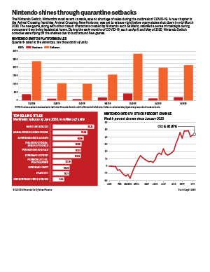
I decided to research how Nintendo sales have changed since the outbreak of COVID-19 in the United States. Right as states in the U.S. started shutting down stores and restaurants in mid-March, Nintendo released the newest installment of the Animal Crossing franchise, Animal Crossing: New Horizons. The nostalgic factor of a franchise that has been around since the release of the Nintendo GameCube releasing a new game before a period of isolation caused a lot of hype on social media. Twitter went wild after the game was released on the Nintendo Switch, and provided something wholesome and fun to do during uncertain and scary times.

As I was looking for data regarding sales, the Nintendo website actually had a lot of data that I was looking for. They had sales data from up until June of this year, which is a pretty decent dataset. However, I wanted to include more data with a wider range, so I found the stock information for Nintendo on Yahoo Finance. That gave a great overview of how the company was doing. Even though games and consoles were supposedly flying off the shelves in March, the stock fell that month and rose up again in April. I wanted to add a graphic that didn’t rely so much on inferring from numbers, so I found information from Nintendo’s website on the top-selling Switch games since the console had been released. I thought it was interesting to see which games were the most popular. I was expecting Animal Crossing: New Horizons to top the list, but it came up in second place.

I stuck with a simple color scheme for this graphic, using a bright red that resembles the logo of Nintendo, and an orange shade to represent the software sales (because the eShop logo is white and orange). I created a new stylesheet for this project and chose a new typeface: Adelle Sans. I had only used Roboto for infographics until now, but I’m happy to choose a new typeface. I like Adelle Sans because it’s really rounded, easy to read, and had lots of variations, including a condensed version.

Overall, I’m pretty satisfied with my graphic. I think the strongest chart in the graphic is the stock changes because it easily shows how Nintendo was affected during the outbreak of COVID-19. However, my favorite chart is the list of the top games on the Switch. I am, really happy with how it turned out, and I feel like it’s a creative way to list the games and their corresponding sales numbers. In the future, I hope to be more creative and think outside the box when it comes to infographics. I tend to stick to the norm because it’s something new to me, but I’m hoping to make something more my style (instead of a basic style) in the next projects.

Categories
Chart

Apple takes a bigger bite

Steve Layton's Chart project
Click the image to see the PDF!

Here are some details about my Chart project. I will be adding real text to this post by the end of this week.

You can have one block for multiple paragraphs.

Here are some details about my Chart project. I will be adding real text to this post by the end of this week.

You can have one block for multiple paragraphs.

Here are some details about my Chart project. I will be adding real text to this post by the end of this week.

You can have one block for multiple paragraphs.

Here are some details about my Chart project. I will be adding real text to this post by the end of this week.

You can have one block for multiple paragraphs.

Here are some details about my Chart project. I will be adding real text to this post by the end of this week.

You can have one block for multiple paragraphs.

Categories
Chart T. Jackson

The Comeback Kids of Colorado

Tristan Jackson's charts project
Click the image to get a better look.

The Denver Nuggets’ playoff run this season was nothing short of spectacular and one of the high points of the NBA bubble. Behind Jamal Murray and Nikola Jokic they came back from two 3-1 leads against the Utah Jazz and the Los Angeles Clippers, but lost to the eventual champion Los Angeles Lakers.

In my project there were a few things I really wanted to hit on. Jamal Murray and Donovan Mitchell battled in the first round and broke NBA playoff scoring records. I challenged myself and went with radar charts to compare Murray’s scoring compared to each of the other team’s leading scorer in each series. I think these three in comparison really show how high Murray and Mitchell’s scoring marks were compared to a normal playoff series.

For my main chart, I really wanted to hit on how much time the Nuggets spent trailing and how crazy their comebacks were. To do this I did a line chart with three different lines — their biggest lead, their biggest deficit and the final point differential. I think it’s pretty telling that the range of the chart was 25 to -40.

Lastly, I wanted to break down who really showed up for the Nuggets in the playoffs and who didn’t play as well. I used simple bar charts to chart five Nuggets players’ regular season stats to their playoff stats. Jamal Murray and Nikola Jokic really stepped up and solidified themselves as the team’s best players, and Paul Millsap and Jerami Grant didn’t step up in the way the Nuggets would have needed them to in order to get past the Lakers.

I think what makes this project work is the prior planning that I did and the time I took to come up with ideas for how I wanted to put this together. It was pretty heavily covered that they were coming back from big deficits, so I wanted that to be the main part of the graphic. I also knew how well Jamal Murray had been playing so I wanted to get something in there about his performance. Then the last group of graphs were simply to show how the team did. If I had tried to brainstorm ideas any later than I did I wouldn’t have had time to actually get them done. I’m happy with how it turned out and would like to continue doing sports-related work in the future.

Categories
A. Mattingly Chart

And the rich get richer

Adam Mattingly's Chart Project
Click the image to see the enlarged infographic.

Income and wealth inequality is one of the biggest issues facing the United States today, and the issues is worsening, becoming more and more urgent. However, the raw numbers in dollars can be difficult for the human mind to comprehend, and many members of the population do not realize how drastic the wealth and income numbers are skewing in favor of a tiny, wealthy top percent of our country. Therefore, I felt these numbers would be represented by comparing percentages, making the information easier to comprehend.

I have included 2 bar graphs, one being a zoomed in version of a smaller portion of the other chart. I felt the lower half of the data needed to be zoomed in to place emphasis on the drastic differences in the increase in incomes between each fifth of the United States population. I also included a single bar broken up into 3 groups of Americans, based on how much wealth they have. I felt it was important to visually show a comparison of the amount of people in each group to show how imbalanced the numbers are, hence the use of the stick figures. My pie chart has a similar goal, portraying how a small percent of Americans make over half of the overall income earned in the entire country. I decided to show this data in just 2 groups, showing how one tiny percentage compares to the entire rest of the country.

The main aspect I struggled with in my package was choosing a color scheme. I was weary of using the same colors on each graph, as the graphs are divided into different percentages of people, but was having difficulty finding 6-7 different colors that fit well together without looking childish. Therefore, I decided to use the same colors to keep the package looking professional and cohesive.

Categories
A. Aguiar Chart

Union membership continues to drop

Annie Aguiar's Chart project.
Click the image to see the full-size PDF.

I really care about labor and workers’ rights and all that (my dad was a Teamster!) so I used the most recent set of data on union membership as released by the Bureau of Labor Statistics.

I was of course struck by the decline evident in the numbers available from 1983 onward., and I wanted to use that line chart as the big piece of the package; I wanted to do some sort of callout box, but two lines with events that apply to both seemed odd to do callout boxes with so I ended up going with this highlighted year/information approach instead and tried to not make it too too text heavy.

The pie chart puts that decline into a larger perspective, showing just how many workers aren’t union-affiliated at all, and the median weekly earnings are there to give some sort of perspective beyond just membership numbers: this is a system that improves pay for workers this flatly laid out, and this system has been declining for years.

I do wish I was more creative with this, but I didn’t want to force any hackneyed graphics of like, workers’ fists or strikes or anything so I figured it was best to just stick to the numbers.

Categories
The class

Welcome to J464!

J464 is a foundational course that teaches information graphics, including their conception, research, writing and execution, focusing on the “main food groups” of charts, maps and diagrams. My goal is that you will leave this class with a solid understanding of what constitutes an effective information graphic as well as the ability to render a variety of different types of graphics, from serious news stories to light-hearted features, from the clear and direct to the complex and engrossing.

Students learn the history of graphics, their prominence in today’s media and their promise for the future. They develop and refine their visual skills, enhancing their ability to illustrate and design so that their graphics have maximum impact and help readers/users better comprehend important events, draw in the curious with essential and arresting visual information and lead them skillfully through complex data in a logical and appealing way.

J464 focuses on skills needed to report and write for graphics, using programs like Excel to create revealing data sets. Students isolate key information and focus on how best to convey that information in a visual way.

To read the full syllabus for this course, go to http://stevelayton.net/j464/f20/