
For the map project, I wanted to document the effects of climate change in an area of the country. I was debating between researching wildfires or hurricane damage. After doing a bit of initial research, I decided to create a graphic about the wildfires in California.
Wildfires have been in the news pretty regularly this year, starting with the wildfires in Australia that destroyed around 26 million acres of land. However, I wanted to cover something a bit more current than that. In California, there are still active fires burning currently and the smoke has traveled into the cities. I’ve seen many Californians posting videos of the fires and smokey skies on social media, and I feel like there have been more fires and damage this year than previous seasons. I found the California Department of Forestry and Fire Protection (CAL FIRE) website and discovered lots of information and records of fires in the past years.
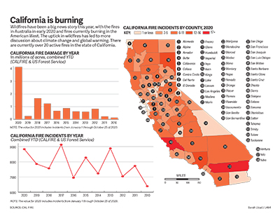
With this information, I was able to create a map with the number of reported fires this year in each county of California. I drew the state outline and each county outline for the map and colored each county using a sequential color scheme according to the total number of incidents I found. It was a bit tedious to tally up that information because I had to go through a chart of each logged fire this year and add to the numbers for each county. I added numbers to locate each of the counties and listed them on the right side of the map.
The two charts were a lot easier to create. I found data for fire damage per year and fire incidents per year in yearly reports, so I logged the numbers in a spreadsheet and transferred them into Illustrator. I chose a bar graph for the fire damage amounts and you can clearly see that the damage this year has surpassed the previous years by a large amount. I chose a line graph for the fire incidents numbers because they tended to fluctuate a bit more and didn’t have any crazy outliers.
The data from CAL FIRE was very useful to draw conclusions and make the charts and maps for this project. I’m glad that I could find all the information I needed in one place. If I was able to change anything in this graphic, I would want to play around with the layout a bit more. All of the county names look a bit crowded. However, I think the color scheme really helps tie everything together and lets the viewer draw simple conclusions with a quick glance.