
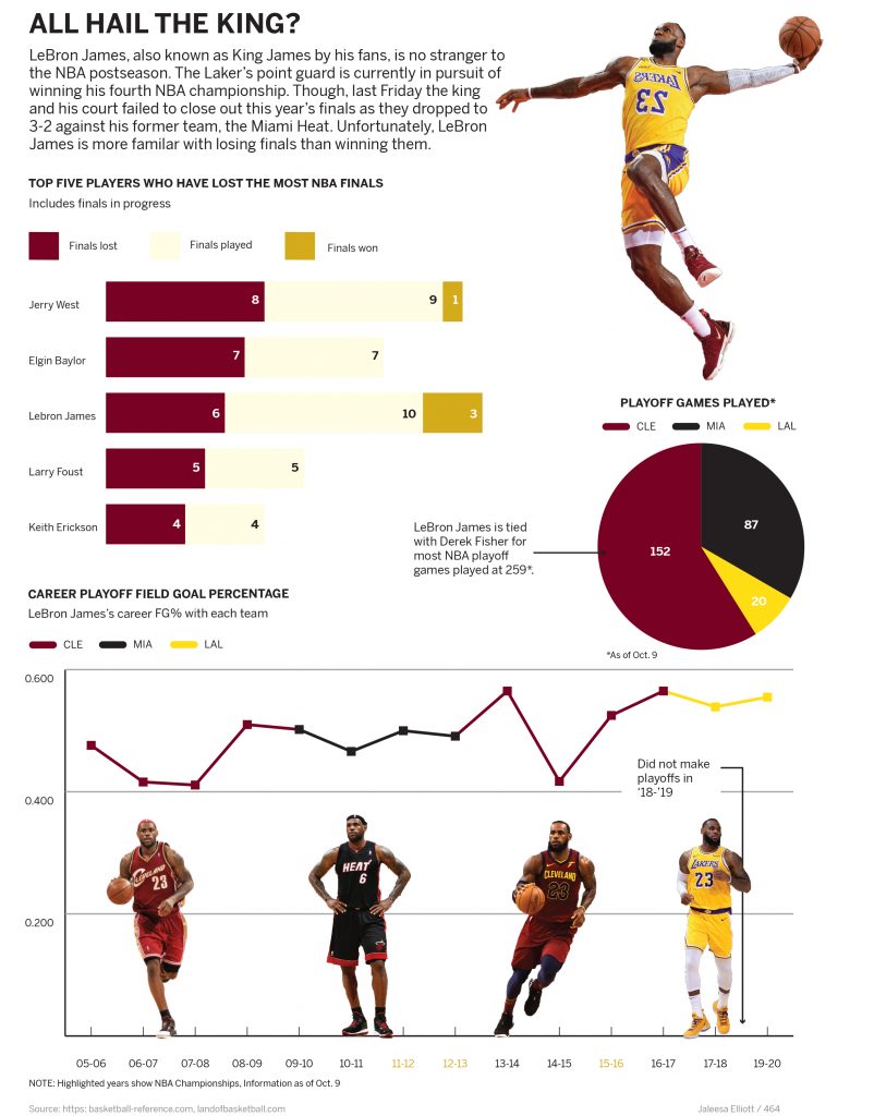
Basketball fans all have their opinion of who is the greatest of all-time. We’ve seen LeBron James dominate the league for the past 17 years. I have always been skeptical of James and his king status, (I think Indiana native, Oscar Robertson is the GOAT). For this infographic I wanted to explore LeBron James playoff history as he was currently competing in the playoffs with the Lakers.
One statistic I found interesting was that he was the third most in playoffs lost. This is shown by the bar graph. I also wanted to highlight the most insane fact, which is James being tied with Derek Fisher for most NBA playoff games. A pie graph visualized this well, and gave me the opportunity to show his statistics with each team. I think that these two graphics together contextualize James’ playoff performance.
The bottom line chart displays James average playoff field goal attempts. With this chart I attempted to highlight his talent and performance but also reinforces his playoff misfortune. Fortunately for James, he did win a championship after this graphic was completed.
One thing I was concerned about was the color scheme of the graphic. I felt like it was appropriate to include the team colors in a sports graphic. Though, I showed the different teams of LeBron and I am not confident that the colors work as well as they could.