
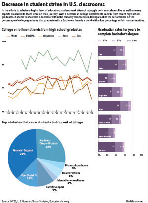
For my first infographic project I decided to look into the stance of minorities within the education system. Specifically heading towards secondary education and further. From the information researched I chose to focus on 3 aspects of information.
The first being the college enrollment rate of recent high school graduates. This information would be able to give. a better understanding on what the trend of how many high school graduates do attend a college/university, and the data was divided by race to be able to track a trend over the previous years. From that point I decided to look into the rate of completion for those pursuing a bachelor’s degree, and this was also sectioned by race as well as institutions that are either 4, 5, 6 years for completion of a bachelor’s. While looking at the data I decided to add information on the reasons that could be behind the incompletion of college students which can also fall into the decision of continuing education after high school. I felt this would give a better look into the decisions made.
I decided to give each graph its own color to avoid any form of mix up with other keys in other graphs. In the graph with graduation rates for bachelor’s degree I decided to have the sections of the stacked bar to transition in a lighter hue to represent the decrease of people that graduate within a longer year institute. I did find some struggle organizing the information for it to not look too plain or with weird spacing. I want to work more on creating a better theme when making the graphs work together, and be able to incorporate more color themes.