
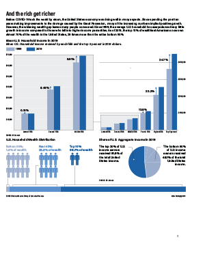
Income and wealth inequality is one of the biggest issues facing the United States today, and the issues is worsening, becoming more and more urgent. However, the raw numbers in dollars can be difficult for the human mind to comprehend, and many members of the population do not realize how drastic the wealth and income numbers are skewing in favor of a tiny, wealthy top percent of our country. Therefore, I felt these numbers would be represented by comparing percentages, making the information easier to comprehend.
I have included 2 bar graphs, one being a zoomed in version of a smaller portion of the other chart. I felt the lower half of the data needed to be zoomed in to place emphasis on the drastic differences in the increase in incomes between each fifth of the United States population. I also included a single bar broken up into 3 groups of Americans, based on how much wealth they have. I felt it was important to visually show a comparison of the amount of people in each group to show how imbalanced the numbers are, hence the use of the stick figures. My pie chart has a similar goal, portraying how a small percent of Americans make over half of the overall income earned in the entire country. I decided to show this data in just 2 groups, showing how one tiny percentage compares to the entire rest of the country.
The main aspect I struggled with in my package was choosing a color scheme. I was weary of using the same colors on each graph, as the graphs are divided into different percentages of people, but was having difficulty finding 6-7 different colors that fit well together without looking childish. Therefore, I decided to use the same colors to keep the package looking professional and cohesive.