
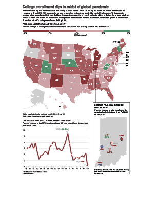
Following the transition from in-person to remote-online learning by colleges and universities across the nation, many predicted an overall decrease in enrollment. While these predictions were true in a majority of states, the drop was less drastic than expected.
The most difficult aspect of this project was gathering data. While I was able to find some recent, reliable data for the U.S. map, finding Fall 2020 enrollment numbers for the Indiana schools was especially challenging. I was unable to find numbers for all of the schools on my list, and I had difficultly making the decision of which schools to include in the first place. Apart from the data, I also am not very pleased with the Indiana map as a whole. I really wanted to incorporate the school logos as a visual component, but it feels to me as if the red is overwhelming, and the map as a whole feels like it’s missing something.
Once again, I struggled with the color palette within the package as a whole. Red and green felt like the best colors to use for differentiating between positive and negative numbers, but these colors inherently register as “Christmas” to me. The choice of red also posed issues within the Indiana map and the overwhelming presence of red within the logos. Overall, I do feel that the package conveys the information I was aiming for, and I do feel confident in the reliability of my data, but my overall styling could use some work for my taste.