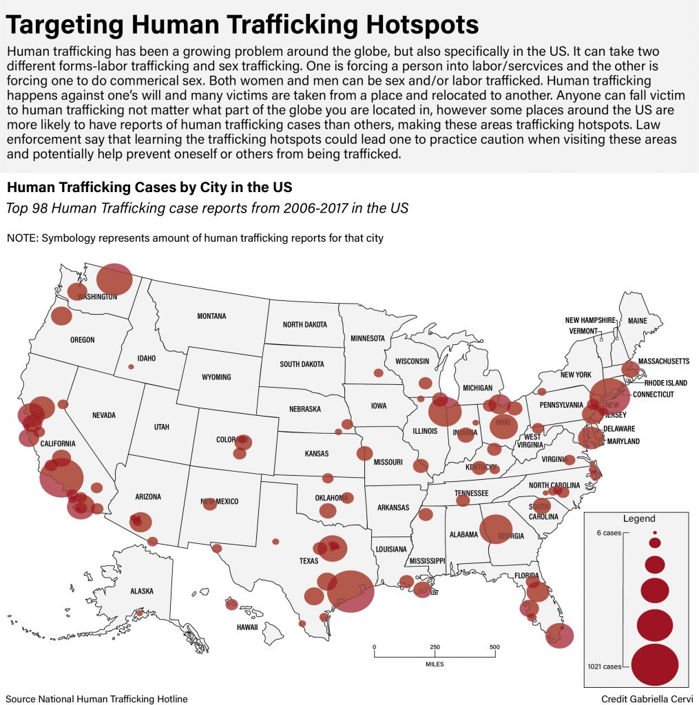
Human trafficking is a topic that I feel strongly about and I feel its important to know that anyone can be trafficked. It is a major issue in the US and that is why I chose this as my topic. There are so many hotspots so I decided to limit it to around the top 100. What took the longest was arranging the dots and coming up with a system on how to do so. Eventually I figured out the best way was to look at a map of cities and line the dots with the proper location on my map. Human Trafficking is alarming this is why I chose the color red and a muted gray so that the hotspots could stand out.
This chloropleth shows the density of NCAA women’s basketball tournament qualifying teams. I tried to use an NCAA blue-adjacent color scheme. The most teams in this year’s tournament came form North Carolina, indicated by the darkest blue color. A few states had no qualifying teams, which are indicated by a grayed out color.
The map I drew consists of San Antonio, San Marcos and Austin, Texas, where all of the women’s tournament games took place. I gave a little more info by including a table showing cities, stadiums and which rounds were hosted by each site.
This map was rather difficult, as the Austin and San Antonio city limits are rather ridiculous, sometimes extended further out by roads to other incorporated areas. The Colorado River was also “fun” to draw, as it gets very thin in parts and disappeared from the map I used to draw it.
For my map project, I chose to do the Masters since it is currently taking place. When creating this graphic, I wanted to stick with the green theme since that is the color of the jacket that the winner of the Masters receives.
I first started off designed the landscape of the trees to give the map that golf course feel. This is the part where I struggled the most because creating this took quite some time and a lot of use of the pen tool. Although this took me awhile to figure out how to achieve, I feel that it came out to look way better than I even expected it to.
Next off, I decided to create the shapes and outlines of all eighteen holes. I went off a scorecard course map to get the most accurate shape of each hole. I also used the pen tool for this aspect of my map design. I then added the hole numbers to their designed spot which took quite some time because I had to figure out which hole was which. After figuring out the hole placement, I then decided to add the yardage of each hole on the side which I found on the Masters website.
When thinking of August National Golf Course, I was trying to think of a key location or area that is known to most people to include. I decided on pin pointing hole 12 since it is one of the most famous holes in all of the golf courses in the world. I simply found an image of it online and added this to my map. After completing this portion of the map, I then added the header and the passage underneath to explain the Masters and Augusta National. Lastly, I felt like there was a lot of open space left in the upper right corner so I decided to place the Masters Tournament logo to this graphic to give the viewer a better idea of what the tournament is if they didn’t already know what it was. Overall, I really enjoyed this project and I found that designing the maps is a very detailed and intricate process.
Click the image above to see a full sized version!
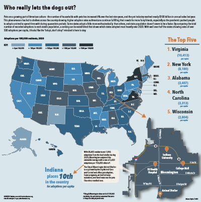
For this map’s subject, I decided to keep going further with the subject of my first project, which dealt with the growing pet culture in America. I thought it would be interesting to see which states actually adopted the most animals and see if there was any kind of trend, and then take it local to see how Bloomington performed.
My primary map is a choropleth of the United States showing the number of adoptions in 2020 per 100,000 residents in each state. I made my own calculations in Excel to find the number of adoptions per capita so that states with higher populations wouldn’t have an unfair advantage of appearing higher on the list. To be able to zoom in on Bloomington’s local rate, I put a dot on Indiana where Bloomington appears in the state and then an arrow leading to my next map. My secondary map represents the city of Bloomington. Giving the city it’s own map allowed me to have a callout with local information, as well as show people where the animal shelter in Bloomington is located. The background color is in line with the primary map key because I wanted to show what range the city fell into. I used orange location markers to mark significant spots around town and placed a star on the animal shelter marker for emphasis. I used a drop shadow to separate the secondary map and give it some depth because I couldn’t make a rectangular background fit in the space.The callout contains information about Bloomington’s 2020 adoptions and general information about the local shelter.
There’s graphic text plainly stating information in two places on the page — the top right and bottom left. I used these because I had space I wanted to fill but wasn’t sure if I could fit another chart, and I thought knowing the actual ranking and/or count of the states would be fun for a viewer. I listed the top five to just really show a handful of the top states and I didn’t want to make the information too small. Since I connected the national map to Indiana through Bloomington, I also wanted to highlight Indiana’s spot in the national list, so I included the second grouping of text as a sort of callout.
I used a few different sources to put these maps together. The bloomington.gov and shelteranimalscount.org websites provided me with adoption numbers, and suburbanstats.org and Statista provided me with population numbers. After getting the data, I had to combine a few things and make my own calculations for what I wanted to map.
Stylistically, I used the same font family as I did for my last project, though sizes changed and I added a few styles in. I also used a related color palette to my last project. It included oranges and blues but featured warm colors much heavier, so I just reversed that for this project and featured the blue instead. I thought this project was actually fun and not too difficult. I got another chance to show some more data from my original topic and actually connect it to where I’m living, and it was generally just fun to make. It was most challenging for me to figure out how to make everything fit together. I wanted Bloomington to be large enough to see the details, and I almost changed my idea because I couldn’t work it out for a while. Ultimately, I’m happy with the way it turned out.
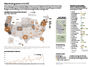
For my project I decided to map mass shootings across the U.S. Mass shootings have been an issue in the U.S. for decades, but this month there were two mass shootings just six days a part, which is why the topic was at the front of my mind. I thought the key factors to cover were where the shootings have happened, how different states compare in mass shooting frequency, gun laws across states and how shootings have increased over time.
My primary map combines a choropleth and proportional symbols map to show where mass shootings have occurred over the last 55 years and how many gun laws are enacted in each state. I thought it would be interesting to show both on one map because I think most people, myself included, would have expected mass shootings to be more prevalent in states with fewer gun laws. I also decided that accounting for population would be important to include – which led to the creation of my secondary graphic that looks at the states with the highest mass shooting rates. I was surprised by some of the states that were still in the top 50% of shooting rates, which is why I decided to add an indicator showing which political party controls the legislature and again the gun laws per state. I also wanted to include a locator map for the most recent mass shooting in Boulder, Colorado since that is what gives the package its newsworthy element. Finally, I chose to include a line chart to show how the frequency of mass shootings has increased over time.
My main source for the package was The Violence Project because they track mass shootings and have an extensive database and solid methodology. Their data base went further back than others that I saw, but I thought their reasoning for going all the way back to 1966 was logical. I also relied heavily on the Washington Post for information on the gun laws in each state. When I first decided to include gun laws, most of the sources I found were lobbying pro or against stricter gun laws, whereas the Washington Post was simply stating what exists where. I also used a handful of other sources, but only for small supporting details.
Stylistically I used my established style guide for font choices and graph layout. In this project I did rely heavily on color to convey the data, so I spent a lot of time on the color scheme. I needed to use a lot of different colors but did not want them to distract from the information. I also spent more time than usual on the internal layout of the package. I had a lot of data and several different pieces, so I did not want the layout to become too tight or hectic. This was one of the harder pieces that I have designed because there were so many different pieces to put together into one cohesive package. But in the end, I was happy with how the project turned out.
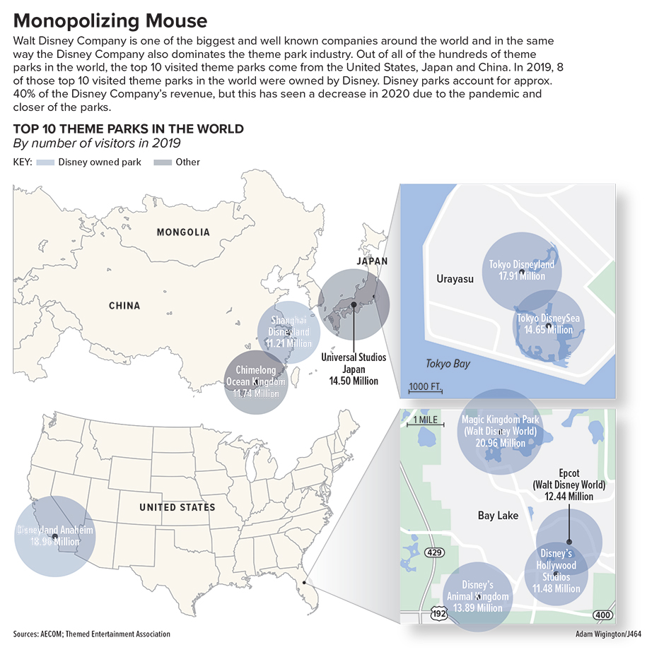
This project was honestly a challenge for me in some ways. Until this class and this project, I had never really made a map graphic before especially where I had to draw my own map. I had landed on this topic of theme parks across the world, because I love going to theme parks and have a particular interest in them. So I found some data on the top 10 visited theme parks of 2019 and based my whole graphic on that. I really only planned on making 1 maybe 2 maps before I found this topic, but I quickly realized that this data is going to be harder to represent than I thought. The parks are spread across 3 countries on opposite side of the map and a majority of them are concentrated to a small enough area that It was hard to represent with just one large map of the world. And if i used a map of the world a majority of it would be empty so I opted to focus on the 3 countries and then have callouts to the smaller areas. Once I had made the maps I had to decide what to do with the locations and I didn’t want to merely make it a locator map. So i landed on proportional symbols to represent the data, but while also including the park name and number of visitors within the proportional symbol. Unfortunately, the proportional symbols were close enough in size that is hard to discern which is the biggest, smallest and so on. So that is another reason for the inclusion of the data on the proportional symbol so the reader can discern the data. All in all I think this project is pretty good, but it is a little busy for my liking. With the data the way is formatted and where is shows up on a map this was the best way to represent it I found, although it might still feel cluttered in some areas.