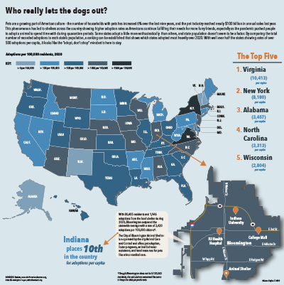
For this map’s subject, I decided to keep going further with the subject of my first project, which dealt with the growing pet culture in America. I thought it would be interesting to see which states actually adopted the most animals and see if there was any kind of trend, and then take it local to see how Bloomington performed.
My primary map is a choropleth of the United States showing the number of adoptions in 2020 per 100,000 residents in each state. I made my own calculations in Excel to find the number of adoptions per capita so that states with higher populations wouldn’t have an unfair advantage of appearing higher on the list. To be able to zoom in on Bloomington’s local rate, I put a dot on Indiana where Bloomington appears in the state and then an arrow leading to my next map. My secondary map represents the city of Bloomington. Giving the city it’s own map allowed me to have a callout with local information, as well as show people where the animal shelter in Bloomington is located. The background color is in line with the primary map key because I wanted to show what range the city fell into. I used orange location markers to mark significant spots around town and placed a star on the animal shelter marker for emphasis. I used a drop shadow to separate the secondary map and give it some depth because I couldn’t make a rectangular background fit in the space.The callout contains information about Bloomington’s 2020 adoptions and general information about the local shelter.
There’s graphic text plainly stating information in two places on the page — the top right and bottom left. I used these because I had space I wanted to fill but wasn’t sure if I could fit another chart, and I thought knowing the actual ranking and/or count of the states would be fun for a viewer. I listed the top five to just really show a handful of the top states and I didn’t want to make the information too small. Since I connected the national map to Indiana through Bloomington, I also wanted to highlight Indiana’s spot in the national list, so I included the second grouping of text as a sort of callout.
I used a few different sources to put these maps together. The bloomington.gov and shelteranimalscount.org websites provided me with adoption numbers, and suburbanstats.org and Statista provided me with population numbers. After getting the data, I had to combine a few things and make my own calculations for what I wanted to map.
Stylistically, I used the same font family as I did for my last project, though sizes changed and I added a few styles in. I also used a related color palette to my last project. It included oranges and blues but featured warm colors much heavier, so I just reversed that for this project and featured the blue instead. I thought this project was actually fun and not too difficult. I got another chance to show some more data from my original topic and actually connect it to where I’m living, and it was generally just fun to make. It was most challenging for me to figure out how to make everything fit together. I wanted Bloomington to be large enough to see the details, and I almost changed my idea because I couldn’t work it out for a while. Ultimately, I’m happy with the way it turned out.