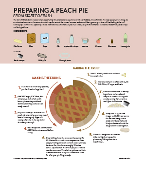
For my project, I created a process diagram explaining how to make a peach pie from scratch. Making a pie from scratch entails making a homemade crust instead of buying a premade one. I’ve heard from some people that creating a homemade pie crust is intimidating, so I wanted my diagram to show the process as simply as possible. At the top of the diagram, I have a listing of the ingredients and tools needed along with illustrations of each. I thought this was particularly important to include them because there are some unusual ingredients like apple cider vinegar in the recipe that I use, and because people unfamiliar with baking may not know what a bench scraper is. The main feature of the diagram is the necessary steps surrounding a pie illustration. In my mind, it made sense to have the instructions going in a circle to frame the pie, and it was conducive to separating the crust steps from the peach filling steps.
Color played an important role in the design of this piece. I felt like I needed to go with a lighter color scheme with pink as the core color to match the pie and baking theme. While I didn’t want the number of colors to get out of hand, I did need quite a few to properly illustrate all of the ingredients and tools, so I tried to be mindful of using colors that complimented each other nicely and fit together. I used color to separate the necessary ingredients and tools from the instructions, and to sperate the filling steps from the crust steps. Sitting behind the pie is also some color blocking to help in showing the steps and again the separation between crust and filling.
For this project, I only used two primary sources and they were the recipes that I always use when making a peach pie myself. Although my source gathering was slightly less laborious than with past projects, I did spend a lot of time trying to find appropriate visual references for all of my icons. For some of the ingredients and tools, I was able to make very simple icons based on what I had in my kitchen and based on ways I had seen things illustrated in the past. For other ingredients that needed a specific element or look to be identifiable, I used Google Images as reference. Similarly, to the process with the color, all of the ingredients or tools were very different from each other, but I tried to use unifying elements so that they could be easily identified as a group that fit together.
Overall, I am happy with how the diagram turned out. I felt less confident going into this project than I had with the others. I don’t consider making icons or lifelike illustrations to be my strong suit. I’m happy with the overall look of the piece, I don’t know that you would see it in a newspaper, but I think it could stand in another type of publication. I’m largely happy with how the icons turned out, I think there is definitely room for improvement though in some of them, and I think in a perfect world I could have been more consistent in the style used. I do like the overall layout of the piece though and how the colors and type came together.