Going Behind the Lens

an exploded diagram of a DSLR camera
Click the image above to see a full-sized PDF!

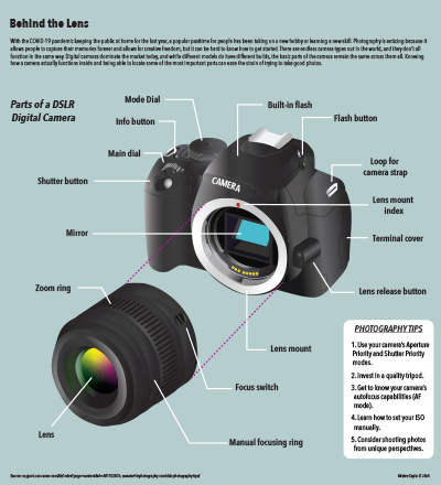
I really struggled to choose a topic for this one, so I ultimately decided to break down something I was familiar with myself. I chose a camera because when I was learning my way around a camera, it took me a while to figure what all the pieces were and what each button was for.

I chose to do a somewhat exploded view of the camera because many beginners or those unfamiliar with cameras at all are not aware of what actually sits behind the lens, if they’re aware the lens can be removed at all. I was able to find some simple drawn diagrams of cameras without lenses on Canon’s site and used those to complete the body of the camera. To complete the lens, I had to find another drawn diagram that included a lens in relatively the same angle as the camera. Once I thought they looked enough like they were actually supposed to fit together, I moved the lens down at an angle to give it the “exploded” effect. There were several pieces of the camera marked on my resource diagrams, but I chose to mark only the ones I thought were the most basic and important to know.

To make the camera look as realistic possible, I used a gradient in essentially every shape I drew for the diagram. I actually didn’t use any 3D effects because I couldn’t figure out how I would get the shape I wanted that way, so this is made up of a lot of flat shapes on different layers. The gradients for the pieces of the body and the lens are all some type of black to gray, but I was able to play around with a point gradient for the lens.

When I was done with the main illustration, the page still felt pretty empty, even with the labels pointing out. I didn’t think I had room to do another diagram, and I wasn’t even sure what I’d do it over, so since this diagram was for beginners I thought it would be nice to fill the empty space with some tips. These are tips I’m already aware of, but I used a blog for the source because I wasn’t sure what would actually be best for a beginner to know. The blog had more tips listed, but I only chose a few key ones to highlight them and be able to fit it in the design.

Creating this diagram took me MUCH longer than I had anticipated, but I was and still am extremely proud of the way it turned out. I would say this is the best thing I’ve managed to create in Illustrator, which is nice because it’s made me realize how much skill I’ve really gained in the last few years that I’ve been using the program in my classes.

Which states adopt the most animals?

Click the image above to see a full sized version!

For this map’s subject, I decided to keep going further with the subject of my first project, which dealt with the growing pet culture in America. I thought it would be interesting to see which states actually adopted the most animals and see if there was any kind of trend, and then take it local to see how Bloomington performed.

My primary map is a choropleth of the United States showing the number of adoptions in 2020 per 100,000 residents in each state. I made my own calculations in Excel to find the number of adoptions per capita so that states with higher populations wouldn’t have an unfair advantage of appearing higher on the list. To be able to zoom in on Bloomington’s local rate, I put a dot on Indiana where Bloomington appears in the state and then an arrow leading to my next map. My secondary map represents the city of Bloomington. Giving the city it’s own map allowed me to have a callout with local information, as well as show people where the animal shelter in Bloomington is located. The background color is in line with the primary map key because I wanted to show what range the city fell into. I used orange location markers to mark significant spots around town and placed a star on the animal shelter marker for emphasis. I used a drop shadow to separate the secondary map and give it some depth because I couldn’t make a rectangular background fit in the space.The callout contains information about Bloomington’s 2020 adoptions and general information about the local shelter.

There’s graphic text plainly stating information in two places on the page — the top right and bottom left. I used these because I had space I wanted to fill but wasn’t sure if I could fit another chart, and I thought knowing the actual ranking and/or count of the states would be fun for a viewer. I listed the top five to just really show a handful of the top states and I didn’t want to make the information too small. Since I connected the national map to Indiana through Bloomington, I also wanted to highlight Indiana’s spot in the national list, so I included the second grouping of text as a sort of callout.

I used a few different sources to put these maps together. The bloomington.gov and shelteranimalscount.org websites provided me with adoption numbers, and suburbanstats.org and Statista provided me with population numbers. After getting the data, I had to combine a few things and make my own calculations for what I wanted to map.

Stylistically, I used the same font family as I did for my last project, though sizes changed and I added a few styles in. I also used a related color palette to my last project. It included oranges and blues but featured warm colors much heavier, so I just reversed that for this project and featured the blue instead. I thought this project was actually fun and not too difficult. I got another chance to show some more data from my original topic and actually connect it to where I’m living, and it was generally just fun to make. It was most challenging for me to figure out how to make everything fit together. I wanted Bloomington to be large enough to see the details, and I almost changed my idea because I couldn’t work it out for a while. Ultimately, I’m happy with the way it turned out.

Animal Love in America

Chart package containing three separate charts pertaining to information on pets in America.
Click the image above to see a full sized version!

For my chart package, I decided to focus on the general growing importance of pets in America. I thought about just researching the pet sales industry or adoption numbers, but I realized that pets are becoming such an important staple in many our culture overall and thought that showing this from multiple angles would be effective.

It was actually quite difficult to find data for this project, which was a problem I did not expect to have. For data concerning adoptions, euthanasia, or other shelter related issues, there was a lot of mixed information. Not all shelters participate in contributing to this kind of data, so depending on the source numbers can be very different. I found the most reliable information on shelteranimalscount.org, a nonprofit that works to put together a reliable national database for data on shelter animals. There was also a lot of relevant information on Statista, but none of the data was free. Since I only needed enough data for two more charts after getting information from Shelter Animals Count, I signed up for a free account that granted me access to two premium data sets for free. With what I could manage to find for free, along with the premium data, I was able to piece information together in order to understand the trends and make these graphs.

My main graph is the bar graph on the total sales of the U.S. pet industry. This is an industry that’s really taken off just in the last few years, and you can see the bars almost double in size from the first year of data to the last. I wanted to include data on this because I wanted to show that Americans are spending more money on their pets than ever before. This reflects their growing importance to us — as pets become more like family members and/or children, people are willing to spend more money to ensure their health and happiness. Even in the year of a global pandemic and widespread unemployment, the sales in this industry continued to climb and reach higher levels, and they’re expected to surpass $100 billion this year.

My other two graphs are more representative of the more physical increase of pets. For the line graph, I wanted to chart both dropping euthanasia numbers along with rising adoption rates, but the difference in numbers was too extreme, and there was no total number for me to calculate a percentage from. I decided to chart the drop in euthanasia to show how American attitudes towards it have changed and it’s far more unacceptable now for shelter animals to be put down, but still included a callout about high adoption numbers so readers could see how these two statistics are related. The pie graphs show the increase in American households that own pets. I thought this was also related to the points of dropping euthanasia and rising adoption because clearly more people are taking pets into their home. The callout from this chart that links to the bar chart also emphasizes just how much people are spending on their pets — just a 5% increase in household ownership has led to nearly a 50% increase.

As for my design choices, I stuck to a palette of muted versions of colors that I’ve seen in animal organizations and logos. I used the Avenir Next Condensed family for my typeface because it’s a sans serif I personally enjoy and it has so many styling options to choose from. I chose to put the image of the dog and cat in the top right to tie into the subject matter of the infographic and also to fill some empty space without stretching the explainer across the full width. I’m pretty pleased with how this turned out — I wish I had some better data, or just access to more free data, but I think I did a relatively good job with what was available to me. I was also concerned about making three charts fit together in a way that looked nice and allowed enough space for them all, but I think I accomplished that successfully as well.