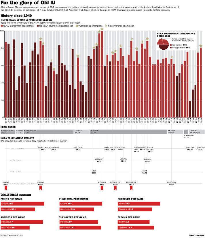
I thought a chart package on IU basketball would be appropriate since the season is about to start, and everyone is really excited thanks to Hoosier Hysteria and students receiving tickets in the mail. I also wanted to show IU’s strong basketball history. I thought there would be a more comprehensive database, but I had to mostly comb through the IU Athletics archives PDF and make my own spreadsheet. They have literally everything anyone would ever want to know about IU basketball, so I spent a lot of time going through the data and trying to figure out what would be relevant from the huge amount. I decided that the overall records would be the focal point and most relevant and interesting. I also wanted to show who was the coach at the time and how they did in the tournament. I started at 1940 because that was the first National Championship, and otherwise there would’ve been way too much. Then I thought it would be relevant to display some stats from last season since the team will be building on that.
I’m very happy with how my chart package turned out overall. I chose reds because of the correlation with IU, and I didn’t want to really use any other colors to distract from that. I used greys where reds would be too much. I really like how the reader can either just glance at the bar chart of records throughout history or go deeper and look underneath to see how far they got and who stopped them. I didn’t realize until it was too late that the bottom red wasn’t from my swatches and was slightly different. Also, if I could go back, I would make the 2012-13 charts smaller and maybe make more. There’s a lot of loose space around them. Overall, though, I really enjoyed the process of going through data and continuously adding information to the graphic, and I’m happy with the end result.

