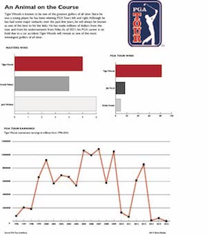
For my chart project, I bounced around with a lot of ideas but I knew I wanted to do something with sports. I chose to do Tiger Woods to highlight his PGA Tour accomplishments especially since his career could possibly be over since his recent car accident.
I first started with researching some topics that I would be able to make three charts about. The first bar chart I chose to do was comparing Tiger’s Masters wins with two other PGA golfers. The other golfers that I chose were Arnold Palmer and Jack Nicklaus. The second bar graph I compared Tiger Woods’ overall PGA Tour wins with PGA golfers Jim Furyk and Rickie Fowlers.
For my line chart which is also graph that makes the biggest statement is Tiger’s PGA Tour earnings from 1996 to 2016. I couldn’t find any information with his tour earnings after 2016. I also found the information in this chart very interesting as his yearly earnings tend to fluctuate quite a bit.
I did have to overcome a few challenges when making this graphic. One challenge was trying to make the PGA Tour Wins chart a pie graph instead of a bar chart. I couldn’t seem to get it to work the way I wanted to so I settled for the bar graph. Another challenge I faced was how to position my chart so that the graphic didn’t look messy as a whole. Overall, I found out a lot of new information about Tiger Woods but also I feel that I am much more comfortable with making charts after this project.
