Indiana Football: a new powerhouse?

A graphic showing IU football statistics.
For a PDF, click here

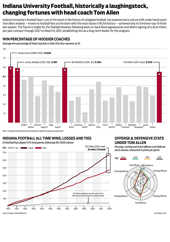
For my project, I focused on the history of IU football. The last two seasons, mediocre by the standards of major football programs like Alabama, Ohio State or Florida, have been some of the best in IU’s history. The program seems to be turning a corner, and there’s optimism the program will continue to grow and continue to win under head coach Tom Allen.

I wanted to make sure that my graphics looked at how historic Allen’s last few seasons have been, and always wanted to include some kind of overarching graphic at the top to prove that fact. I settled on coaching win percentages since the amount of games played each season has changed dramatically over the years, and win percentage is just a fairly simple calculation that’s consistently regarded as a measure of a successful coach. Even better, the sportsreference.com site calculates this for us each season. I also limited the calculation for just the first four seasons of a coach’s tenure because Allen has been here only four years, and I wanted to compare his win percentage (.550) to other coaches in their first four years as well. Some coaches didn’t make it four years at IU, so I noted that. I highlighted the coaches who were better than .500, or coaches who won more than they lost, in an IU red, and added a callout with their full names, win percentage and the first four years of their coaching career at IU. To additionally draw readers to those coaches, I muted the colors and included only coaches’ last names, though I had to stagger them into two rows so that all of the names could be seen.

In my second chart I wanted to show how IU became, statistically, the worst team in college football history, and how hard it will be to change that statistic. I used a line chart to show the total wins, losses and ties, which were eliminated in 1996 (noted with a callout). I added. a gray backdrop to every other decade so it was easier to read the graphic and understand which decades were good, bad or otherwise. I also added a callout to show where Allen’s tenure has come in IU’s history, using a box. You can see that the trajectory of the lines start to change under Allen, but it will take long-term success to get IU to the point where it has more football wins than losses.

For my final chart, I tried my hand at a radar graph, using the sportsreference.com data to chart various offensive and defensive statistics over Allen’s time at IU. There’s nothing particularly notable, but it was an interesting way to display otherwise rather boring data.

Luckily, data was easy to find. I also stuck with my graphic style throughout the semester, using Boomer Condensed for all of my text, and a fairly IU-centric color scheme, which happen to also be my favorite colors (although that didn’t factor into my decision to enroll here). I’m very happy with how this turned out. I tried a few different chart types for each of the examples, and one point was a little concerned how it would turn out, but now that’s it’s completed I’m quite proud of it.

Women’s representation in government

Women's Representation Graphic
Click the graphic above for PDF

For my project, I decided to focus on women’s representation in government. Kamala Harris as the first female vice president was a huge step forward for women’s representation, but also showed how far behind the U.S. still is. I decided to focus my research on how the U.S. compares to other countries, and how the current representation compares to what it used to be. I concentrated on women in congress because it had the most data available and was easily comparable to other countries with multi-person government bodies.

My primary chart focuses on women’s representation in governments worldwide. The Inter-Parliamentary Union collects data from 190 countries and reports how many women are in the lower and upper houses. I decided to show the top 10% of countries for women’s representation because I felt it showed enough countries to paint a picture, without getting bogged down with too much data. I wanted to include a bar showing the U.S. because I think it gives a strong visual representation of how far behind other countries we are. My secondary chart shows the breakdown of men to women in the current congress. I felt it was important to show where the 27% of women come from and again, the small pie slices help emphasize how few women there are actually are in congress today. I gathered the data from the official website of congress where they have all current members listed. Finally, I wanted to include the line chart to illustrate that despite having such a small portion of congresswomen, it is the most that we have ever had. Rutgers University has a center dedicated to the history of women in congress and I felt it was important for illustrating the whole picture of where women stand in our government.

It took some digging to find reputable, data heavy sources because this topic is something that gets discussed in media often and I wanted to be sure to find the original, accurate sources. It was also important to find sources that used similar methodologies in counting representatives. For example, some sources include delegates in the count for the House of Representatives and others do not. (I chose to not include delegates because the most common count for congressmembers is 535.) Also, because of the recent U.S. election, it was important that all of the sources had the most up-to-date information possible.

Stylistically, my typeface family was Brandon Grotesque, and I chose to work in a color pallet that included grey and a dusty rose. I wanted to keep the style clean and minimal so that the data was the focus. I also tried to give a clear hierarchy to the chart showing the worldwide data and hoped to visually guide the viewer through the charts in a logical way. Overall, I am happy with how the chart package turned out. I think it has better spacing and sizing than some of my previous charts and it represents data that I care about.

Inside the Three Gorges dam

Three Gorges Dam graphic
Click the graphic above to see a PDF!

Here is my reflection for the first project, a chart package. I promise that this post will have real text and not placeholder text by the end of the day on Sunday.

Exonerations by Race

Exonerations by Race Infographic
Exoneration Infographic.

For my chart project I decided to base it of the topic of exonerations because it is a topic I am quite passionate about as I feel that there are many innocent people in jail, some due to their race, that are found guilty and are soon to be executed. There was a lot of information to chart so I decided to focus on race and exonerations to see how race effects the perspective of innocent people in jail. My charts clearly show a racial disparity, most clearly between white and black inmates. For example there were more white inmates but the most exonerations are of black inmates. There are plenty of charts and numbers that show more examples of this racial disparity. As for the design , I used orange because that is a typical color thought of when thinking of inmates due to the infamous orange jumpsuit. Pie graphs were used because this best displayed many percentage based data I wanted to present. I drew up some images to put in my chart package so the reader has better perspective of what my project is about. Important information like the callout in the main graph help support my topic of racial disparity and exonerations in America. I found the layout to be the most challenging part of my design process because there was so much information to display that I didn’t quite know where to place it. I decided it would be easiest to design it as if it were an infographic poster that would be printed out. Overall, I am happy with my design and I believe it helps me and other readers perceive the relationship between racial disparity and exonerations in America.

Cutting the Cord

Streaming services graphic
Click the graphic above to see the PDF

In this project, I wanted to explore the streaming industry and partially compare it to the state of the cable industry. The biggest struggle I have on graph project is the explainers, because writing is not my particular strength. So, I made sure to allow myself more time to write a better explainer than in previous assignments. For this project I made the whole package within 29p6, which was a bit of a restriction, but I wanted to restrict myself and make a chart that was effective within a smaller space. Even though I thought the actual designing was going to be the most difficult aspect, I was wrong. The biggest road block I ran into was collecting data. I explored for what seemed like hours trying to find relevant and useful data. More than just finding relevant data it was even harder trying to find data that was comparable in the cable industry so I could compare the 2 industries within a line chart. 

In regards to the design and colors, I stuck with a monochromatic red color scheme mainly to create cohesion and I chose red because it is the color of the number 1 streaming company in the states, Netflix. The one thing I wrestled with when making this graphic, was I wanted to make some sort of engaging image or graphic that was related to the subject to break up the monotony of just graphs. I could never figure out what imagery would be a good fit, but rather than forcing it and possibly making the project worse, I refrained and left it the same. 

Overall, this project was fun and it was interesting to find my won data for the project which added a new dynamic and challenge. 

Animal Love in America

Chart package containing three separate charts pertaining to information on pets in America.
Click the image above to see a full sized version!

For my chart package, I decided to focus on the general growing importance of pets in America. I thought about just researching the pet sales industry or adoption numbers, but I realized that pets are becoming such an important staple in many our culture overall and thought that showing this from multiple angles would be effective.

It was actually quite difficult to find data for this project, which was a problem I did not expect to have. For data concerning adoptions, euthanasia, or other shelter related issues, there was a lot of mixed information. Not all shelters participate in contributing to this kind of data, so depending on the source numbers can be very different. I found the most reliable information on shelteranimalscount.org, a nonprofit that works to put together a reliable national database for data on shelter animals. There was also a lot of relevant information on Statista, but none of the data was free. Since I only needed enough data for two more charts after getting information from Shelter Animals Count, I signed up for a free account that granted me access to two premium data sets for free. With what I could manage to find for free, along with the premium data, I was able to piece information together in order to understand the trends and make these graphs.

My main graph is the bar graph on the total sales of the U.S. pet industry. This is an industry that’s really taken off just in the last few years, and you can see the bars almost double in size from the first year of data to the last. I wanted to include data on this because I wanted to show that Americans are spending more money on their pets than ever before. This reflects their growing importance to us — as pets become more like family members and/or children, people are willing to spend more money to ensure their health and happiness. Even in the year of a global pandemic and widespread unemployment, the sales in this industry continued to climb and reach higher levels, and they’re expected to surpass $100 billion this year.

My other two graphs are more representative of the more physical increase of pets. For the line graph, I wanted to chart both dropping euthanasia numbers along with rising adoption rates, but the difference in numbers was too extreme, and there was no total number for me to calculate a percentage from. I decided to chart the drop in euthanasia to show how American attitudes towards it have changed and it’s far more unacceptable now for shelter animals to be put down, but still included a callout about high adoption numbers so readers could see how these two statistics are related. The pie graphs show the increase in American households that own pets. I thought this was also related to the points of dropping euthanasia and rising adoption because clearly more people are taking pets into their home. The callout from this chart that links to the bar chart also emphasizes just how much people are spending on their pets — just a 5% increase in household ownership has led to nearly a 50% increase.

As for my design choices, I stuck to a palette of muted versions of colors that I’ve seen in animal organizations and logos. I used the Avenir Next Condensed family for my typeface because it’s a sans serif I personally enjoy and it has so many styling options to choose from. I chose to put the image of the dog and cat in the top right to tie into the subject matter of the infographic and also to fill some empty space without stretching the explainer across the full width. I’m pretty pleased with how this turned out — I wish I had some better data, or just access to more free data, but I think I did a relatively good job with what was available to me. I was also concerned about making three charts fit together in a way that looked nice and allowed enough space for them all, but I think I accomplished that successfully as well.

The GOAT: Tiger Woods

Tiger Woods Chart
Click the image above to see a PDF!

For my chart project, I bounced around with a lot of ideas but I knew I wanted to do something with sports. I chose to do Tiger Woods to highlight his PGA Tour accomplishments especially since his career could possibly be over since his recent car accident.

I first started with researching some topics that I would be able to make three charts about. The first bar chart I chose to do was comparing Tiger’s Masters wins with two other PGA golfers. The other golfers that I chose were Arnold Palmer and Jack Nicklaus. The second bar graph I compared Tiger Woods’ overall PGA Tour wins with PGA golfers Jim Furyk and Rickie Fowlers.

For my line chart which is also graph that makes the biggest statement is Tiger’s PGA Tour earnings from 1996 to 2016. I couldn’t find any information with his tour earnings after 2016. I also found the information in this chart very interesting as his yearly earnings tend to fluctuate quite a bit.

I did have to overcome a few challenges when making this graphic. One challenge was trying to make the PGA Tour Wins chart a pie graph instead of a bar chart. I couldn’t seem to get it to work the way I wanted to so I settled for the bar graph. Another challenge I faced was how to position my chart so that the graphic didn’t look messy as a whole. Overall, I found out a lot of new information about Tiger Woods but also I feel that I am much more comfortable with making charts after this project.