The Anatomy of the Golf Swing

Click the image to view my diagram project as a PDF!

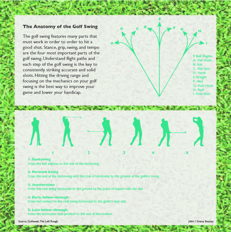
To keep with my golf theme for this semester, I decided to do the anatomy of the golf swing. I first started with doing some research on the golf swing and what specific aspects I should include. I used the websites Golfweek and The Left Rough to gather my information. Since Tiger Woods will forever be one of my favorite golfers, I decided to use his step by step swing to demonstrate the five motions of the golf swing.

I used the pen tool in order to trace around all six motions of the golf swing and then I placed them in order. Between my own golfing knowledge and The Left Rough, I wrote what each movement was and what happened during it. Lastly, I added a background to this portion and messed with the opacity a bit.

When thinking of golf and the golf swing, there are many important elements that go into perfecting your golf game. With that information, I decided to demonstrate the nine types of flight paths for a golf ball. This was quite simple as I used the line tool and added arrows to each line and key on the side to match the flight path to the corresponding line. I also decided to do a background on this portion too. For the main background of my diagram, I went with short cut grass to portray the fairway of a golf course. Lastly, I added my header and explainer. The biggest challenge I faced in this project was my color choices. Personally, I don’t find green to be the most pleasing color but I believe I did a good job with finding the right match for my project.

The Green Jacket

Click this image to open a PDF of my design!

For my map project, I chose to do the Masters since it is currently taking place. When creating this graphic, I wanted to stick with the green theme since that is the color of the jacket that the winner of the Masters receives.

I first started off designed the landscape of the trees to give the map that golf course feel. This is the part where I struggled the most because creating this took quite some time and a lot of use of the pen tool. Although this took me awhile to figure out how to achieve, I feel that it came out to look way better than I even expected it to.

Next off, I decided to create the shapes and outlines of all eighteen holes. I went off a scorecard course map to get the most accurate shape of each hole. I also used the pen tool for this aspect of my map design. I then added the hole numbers to their designed spot which took quite some time because I had to figure out which hole was which. After figuring out the hole placement, I then decided to add the yardage of each hole on the side which I found on the Masters website.

When thinking of August National Golf Course, I was trying to think of a key location or area that is known to most people to include. I decided on pin pointing hole 12 since it is one of the most famous holes in all of the golf courses in the world. I simply found an image of it online and added this to my map. After completing this portion of the map, I then added the header and the passage underneath to explain the Masters and Augusta National. Lastly, I felt like there was a lot of open space left in the upper right corner so I decided to place the Masters Tournament logo to this graphic to give the viewer a better idea of what the tournament is if they didn’t already know what it was. Overall, I really enjoyed this project and I found that designing the maps is a very detailed and intricate process.

The GOAT: Tiger Woods

Tiger Woods Chart
Click the image above to see a PDF!

For my chart project, I bounced around with a lot of ideas but I knew I wanted to do something with sports. I chose to do Tiger Woods to highlight his PGA Tour accomplishments especially since his career could possibly be over since his recent car accident.

I first started with researching some topics that I would be able to make three charts about. The first bar chart I chose to do was comparing Tiger’s Masters wins with two other PGA golfers. The other golfers that I chose were Arnold Palmer and Jack Nicklaus. The second bar graph I compared Tiger Woods’ overall PGA Tour wins with PGA golfers Jim Furyk and Rickie Fowlers.

For my line chart which is also graph that makes the biggest statement is Tiger’s PGA Tour earnings from 1996 to 2016. I couldn’t find any information with his tour earnings after 2016. I also found the information in this chart very interesting as his yearly earnings tend to fluctuate quite a bit.

I did have to overcome a few challenges when making this graphic. One challenge was trying to make the PGA Tour Wins chart a pie graph instead of a bar chart. I couldn’t seem to get it to work the way I wanted to so I settled for the bar graph. Another challenge I faced was how to position my chart so that the graphic didn’t look messy as a whole. Overall, I found out a lot of new information about Tiger Woods but also I feel that I am much more comfortable with making charts after this project.