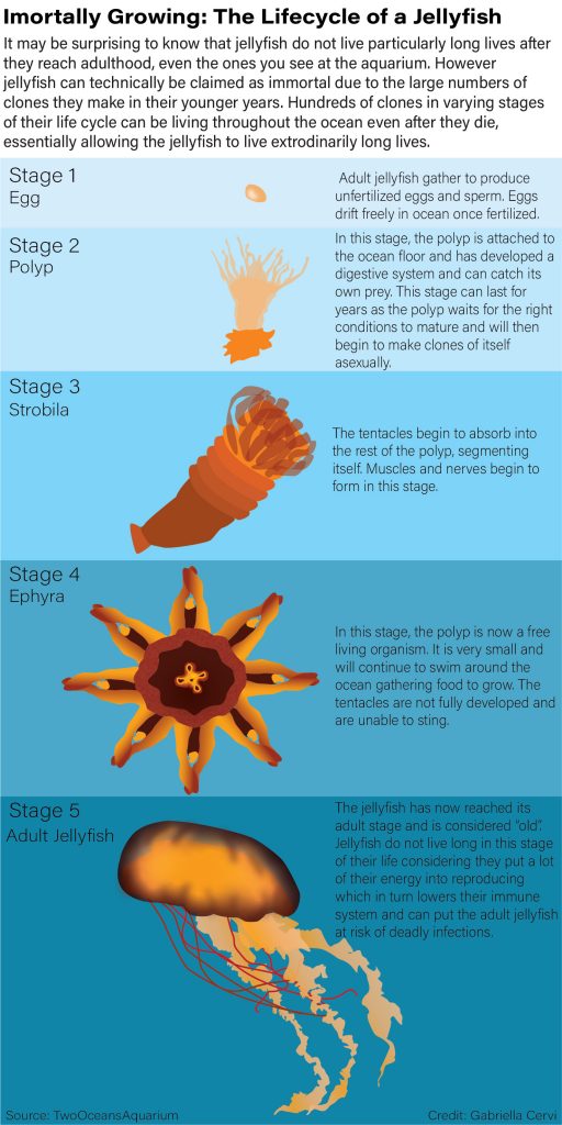
I had the most issues with picking a topic over everything else. I decided to do jellyfish because they have a very interesting life considering they are technically immortal. I chose the colors of my favorite type of jellyfish. I was having trouble deciding how to display the different stages because I wanted to do something different than a typical lifecycle diagram. So I decided to display the stages vertically. It wasn’t easy at first to read the order of the stages with a solid color background, so I then had the idea to create different colored boxes and make them larger the higher the stage of the life cycle was. I used different opacities, blur effects, and gradient tool to make my diagram seem more realistic.
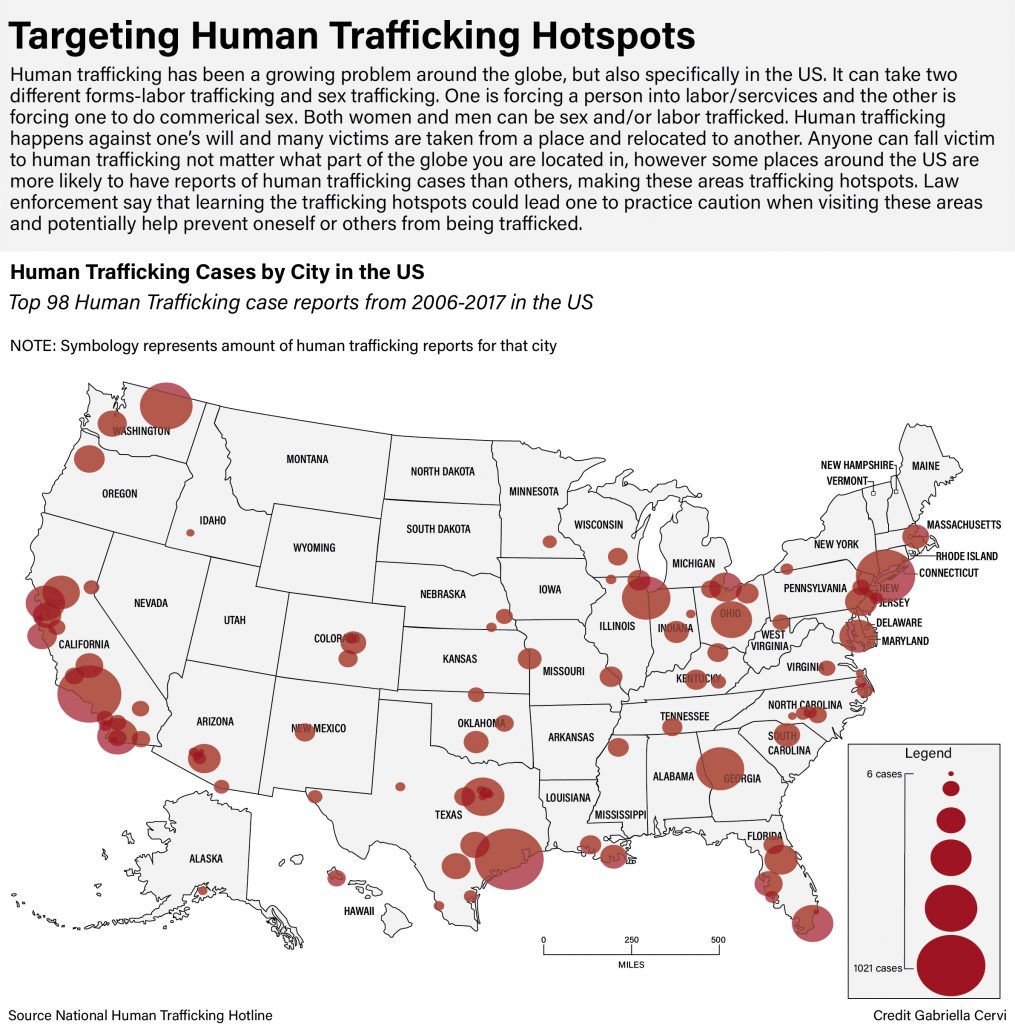
Human trafficking is a topic that I feel strongly about and I feel its important to know that anyone can be trafficked. It is a major issue in the US and that is why I chose this as my topic. There are so many hotspots so I decided to limit it to around the top 100. What took the longest was arranging the dots and coming up with a system on how to do so. Eventually I figured out the best way was to look at a map of cities and line the dots with the proper location on my map. Human Trafficking is alarming this is why I chose the color red and a muted gray so that the hotspots could stand out.
For my chart project I decided to base it of the topic of exonerations because it is a topic I am quite passionate about as I feel that there are many innocent people in jail, some due to their race, that are found guilty and are soon to be executed. There was a lot of information to chart so I decided to focus on race and exonerations to see how race effects the perspective of innocent people in jail. My charts clearly show a racial disparity, most clearly between white and black inmates. For example there were more white inmates but the most exonerations are of black inmates. There are plenty of charts and numbers that show more examples of this racial disparity. As for the design , I used orange because that is a typical color thought of when thinking of inmates due to the infamous orange jumpsuit. Pie graphs were used because this best displayed many percentage based data I wanted to present. I drew up some images to put in my chart package so the reader has better perspective of what my project is about. Important information like the callout in the main graph help support my topic of racial disparity and exonerations in America. I found the layout to be the most challenging part of my design process because there was so much information to display that I didn’t quite know where to place it. I decided it would be easiest to design it as if it were an infographic poster that would be printed out. Overall, I am happy with my design and I believe it helps me and other readers perceive the relationship between racial disparity and exonerations in America.