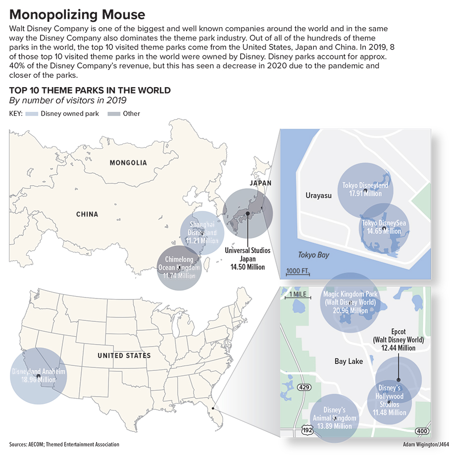
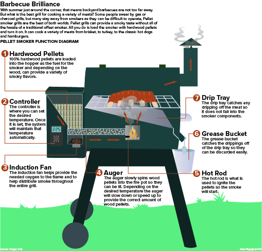
For this project I wanted to do something related to grills, because I love grilling the summer. This project fun, because I had the opportunity to do more drawing and to have more of a visually creative aspect than what other project like the graph don’t really lend themselves to. I think the diagram is clear in what it is doing, but I just wished I could have made the grill a bit more photo realistic. It is hard to balance the line of photo realism when you are x-raying into a grill. So I settled on a more cartoonish version of a grill, that still got the message across to the viewers. The diagram is meant for the viewer to follow the explainer from the top down through the grill while following either the arrows or the numbered bullet points. Either way this serves as a annotated grill as well as a step, by step diagram to show how a pellet smoker works. I think there could have been a few improvements to this diagram, but overall I like the way it turned out in the end.
Monopolizing Mouse
This project was honestly a challenge for me in some ways. Until this class and this project, I had never really made a map graphic before especially where I had to draw my own map. I had landed on this topic of theme parks across the world, because I love going to theme parks and have a particular interest in them. So I found some data on the top 10 visited theme parks of 2019 and based my whole graphic on that. I really only planned on making 1 maybe 2 maps before I found this topic, but I quickly realized that this data is going to be harder to represent than I thought. The parks are spread across 3 countries on opposite side of the map and a majority of them are concentrated to a small enough area that It was hard to represent with just one large map of the world. And if i used a map of the world a majority of it would be empty so I opted to focus on the 3 countries and then have callouts to the smaller areas. Once I had made the maps I had to decide what to do with the locations and I didn’t want to merely make it a locator map. So i landed on proportional symbols to represent the data, but while also including the park name and number of visitors within the proportional symbol. Unfortunately, the proportional symbols were close enough in size that is hard to discern which is the biggest, smallest and so on. So that is another reason for the inclusion of the data on the proportional symbol so the reader can discern the data. All in all I think this project is pretty good, but it is a little busy for my liking. With the data the way is formatted and where is shows up on a map this was the best way to represent it I found, although it might still feel cluttered in some areas.
Cutting the Cord
In this project, I wanted to explore the streaming industry and partially compare it to the state of the cable industry. The biggest struggle I have on graph project is the explainers, because writing is not my particular strength. So, I made sure to allow myself more time to write a better explainer than in previous assignments. For this project I made the whole package within 29p6, which was a bit of a restriction, but I wanted to restrict myself and make a chart that was effective within a smaller space. Even though I thought the actual designing was going to be the most difficult aspect, I was wrong. The biggest road block I ran into was collecting data. I explored for what seemed like hours trying to find relevant and useful data. More than just finding relevant data it was even harder trying to find data that was comparable in the cable industry so I could compare the 2 industries within a line chart.
In regards to the design and colors, I stuck with a monochromatic red color scheme mainly to create cohesion and I chose red because it is the color of the number 1 streaming company in the states, Netflix. The one thing I wrestled with when making this graphic, was I wanted to make some sort of engaging image or graphic that was related to the subject to break up the monotony of just graphs. I could never figure out what imagery would be a good fit, but rather than forcing it and possibly making the project worse, I refrained and left it the same.
Overall, this project was fun and it was interesting to find my won data for the project which added a new dynamic and challenge.