For my project, I decided to focus on women’s representation in government. Kamala Harris as the first female vice president was a huge step forward for women’s representation, but also showed how far behind the U.S. still is. I decided to focus my research on how the U.S. compares to other countries, and how the current representation compares to what it used to be. I concentrated on women in congress because it had the most data available and was easily comparable to other countries with multi-person government bodies.
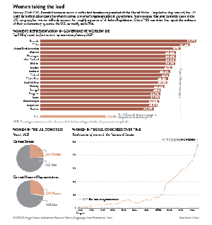
My primary chart focuses on women’s representation in governments worldwide. The Inter-Parliamentary Union collects data from 190 countries and reports how many women are in the lower and upper houses. I decided to show the top 10% of countries for women’s representation because I felt it showed enough countries to paint a picture, without getting bogged down with too much data. I wanted to include a bar showing the U.S. because I think it gives a strong visual representation of how far behind other countries we are. My secondary chart shows the breakdown of men to women in the current congress. I felt it was important to show where the 27% of women come from and again, the small pie slices help emphasize how few women there are actually are in congress today. I gathered the data from the official website of congress where they have all current members listed. Finally, I wanted to include the line chart to illustrate that despite having such a small portion of congresswomen, it is the most that we have ever had. Rutgers University has a center dedicated to the history of women in congress and I felt it was important for illustrating the whole picture of where women stand in our government.
It took some digging to find reputable, data heavy sources because this topic is something that gets discussed in media often and I wanted to be sure to find the original, accurate sources. It was also important to find sources that used similar methodologies in counting representatives. For example, some sources include delegates in the count for the House of Representatives and others do not. (I chose to not include delegates because the most common count for congressmembers is 535.) Also, because of the recent U.S. election, it was important that all of the sources had the most up-to-date information possible.
Stylistically, my typeface family was Brandon Grotesque, and I chose to work in a color pallet that included grey and a dusty rose. I wanted to keep the style clean and minimal so that the data was the focus. I also tried to give a clear hierarchy to the chart showing the worldwide data and hoped to visually guide the viewer through the charts in a logical way. Overall, I am happy with how the chart package turned out. I think it has better spacing and sizing than some of my previous charts and it represents data that I care about.