For my chart package, I decided to focus on the general growing importance of pets in America. I thought about just researching the pet sales industry or adoption numbers, but I realized that pets are becoming such an important staple in many our culture overall and thought that showing this from multiple angles would be effective.
It was actually quite difficult to find data for this project, which was a problem I did not expect to have. For data concerning adoptions, euthanasia, or other shelter related issues, there was a lot of mixed information. Not all shelters participate in contributing to this kind of data, so depending on the source numbers can be very different. I found the most reliable information on shelteranimalscount.org, a nonprofit that works to put together a reliable national database for data on shelter animals. There was also a lot of relevant information on Statista, but none of the data was free. Since I only needed enough data for two more charts after getting information from Shelter Animals Count, I signed up for a free account that granted me access to two premium data sets for free. With what I could manage to find for free, along with the premium data, I was able to piece information together in order to understand the trends and make these graphs.
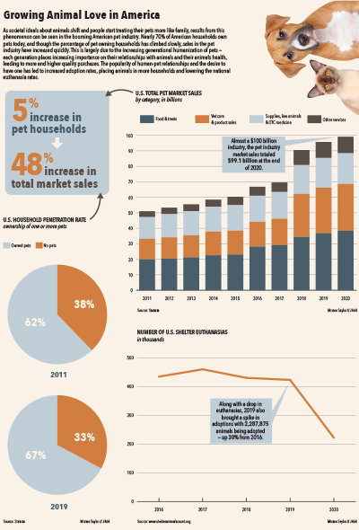
My main graph is the bar graph on the total sales of the U.S. pet industry. This is an industry that’s really taken off just in the last few years, and you can see the bars almost double in size from the first year of data to the last. I wanted to include data on this because I wanted to show that Americans are spending more money on their pets than ever before. This reflects their growing importance to us — as pets become more like family members and/or children, people are willing to spend more money to ensure their health and happiness. Even in the year of a global pandemic and widespread unemployment, the sales in this industry continued to climb and reach higher levels, and they’re expected to surpass $100 billion this year.
My other two graphs are more representative of the more physical increase of pets. For the line graph, I wanted to chart both dropping euthanasia numbers along with rising adoption rates, but the difference in numbers was too extreme, and there was no total number for me to calculate a percentage from. I decided to chart the drop in euthanasia to show how American attitudes towards it have changed and it’s far more unacceptable now for shelter animals to be put down, but still included a callout about high adoption numbers so readers could see how these two statistics are related. The pie graphs show the increase in American households that own pets. I thought this was also related to the points of dropping euthanasia and rising adoption because clearly more people are taking pets into their home. The callout from this chart that links to the bar chart also emphasizes just how much people are spending on their pets — just a 5% increase in household ownership has led to nearly a 50% increase.
As for my design choices, I stuck to a palette of muted versions of colors that I’ve seen in animal organizations and logos. I used the Avenir Next Condensed family for my typeface because it’s a sans serif I personally enjoy and it has so many styling options to choose from. I chose to put the image of the dog and cat in the top right to tie into the subject matter of the infographic and also to fill some empty space without stretching the explainer across the full width. I’m pretty pleased with how this turned out — I wish I had some better data, or just access to more free data, but I think I did a relatively good job with what was available to me. I was also concerned about making three charts fit together in a way that looked nice and allowed enough space for them all, but I think I accomplished that successfully as well.