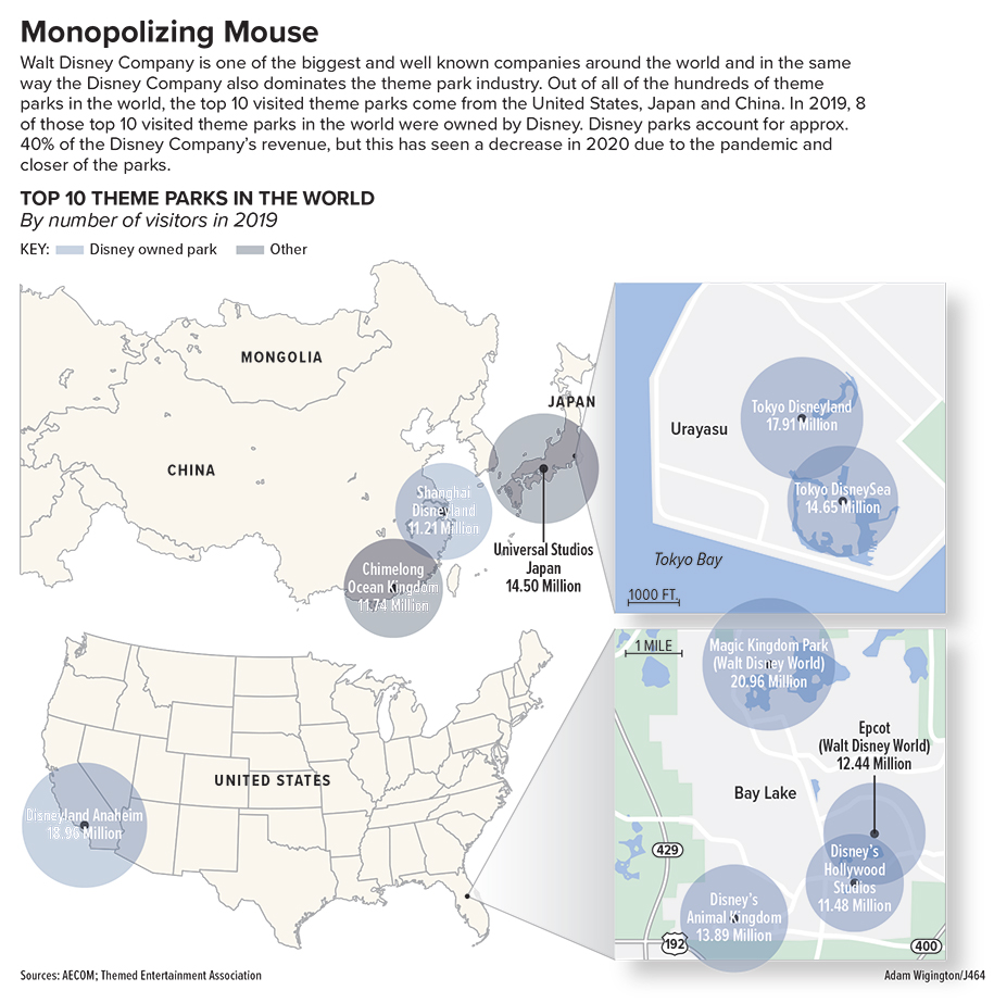
This project was honestly a challenge for me in some ways. Until this class and this project, I had never really made a map graphic before especially where I had to draw my own map. I had landed on this topic of theme parks across the world, because I love going to theme parks and have a particular interest in them. So I found some data on the top 10 visited theme parks of 2019 and based my whole graphic on that. I really only planned on making 1 maybe 2 maps before I found this topic, but I quickly realized that this data is going to be harder to represent than I thought. The parks are spread across 3 countries on opposite side of the map and a majority of them are concentrated to a small enough area that It was hard to represent with just one large map of the world. And if i used a map of the world a majority of it would be empty so I opted to focus on the 3 countries and then have callouts to the smaller areas. Once I had made the maps I had to decide what to do with the locations and I didn’t want to merely make it a locator map. So i landed on proportional symbols to represent the data, but while also including the park name and number of visitors within the proportional symbol. Unfortunately, the proportional symbols were close enough in size that is hard to discern which is the biggest, smallest and so on. So that is another reason for the inclusion of the data on the proportional symbol so the reader can discern the data. All in all I think this project is pretty good, but it is a little busy for my liking. With the data the way is formatted and where is shows up on a map this was the best way to represent it I found, although it might still feel cluttered in some areas.